
Substack helps anyone set up a website and email newsletter so you can build your own media business, supported by subscribers. Part of the magic of Substack has always been how easy it is to start a publication—no tech knowledge is required. While maintaining that ease, we want to give you customization where it counts, with tools that help you match your brand and style to your writing.
In this guide, we’ll walk you through the tools that you have to add polish and personality to your website and to organize your posts, creating an easy-to-navigate experience for readers.
Before we get into the tools, let’s first review the key components of a Substack website and some examples of how other writers have designed their websites.

Overview
Substack website
Your Substack website has two key pages: the welcome page and the homepage. The welcome page is where a reader lands when they visit your publication for the first time. The homepage is where readers can explore your latest posts and you can organize your full archive.
Both pages have been carefully designed to let your writing shine and help you communicate your brand style.

Image dimension key
Logo: At least 256 x 256 pixels, with a transparent background
Wordmark: At least 1,344 x 256 pixels, with a maximum aspect ratio of 21:4
Cover photo: At least 600 x 600 pixels
Social/post preview image: We recommend at least 1,456 x 1,048 pixels, but 420 x 300 is the minimum. 14:10 is the aspect ratio for the preview images.
If these numbers feel overwhelming and you don’t know where to begin with website design, don’t worry. Uploading any image will help add some personality to your publication, and our system will crop it to make it look its best.

Get inspired
With varying design skills, interests, and resources, writers are finding a way to create an aesthetic that matches their writing.
The DIY approach

Valorie Clark uses Canva to create a library of assets she can pull from to add images to Unruly Figures. Her advice to writers: “I think the key is finding something that appeals to you personally and is also endlessly malleable. When I created the branding for Unruly Figures, I made files of dozens of imagery motifs, little sketch accents that I can pull in whenever I start a new section or feel like the look needs a bit of a refresh.”
Leah Mennies, who publishes Above the Fold, a Substack about dumplings and the people who make them, creates her own visual assets using Canva to give her publication a magazine-like feel.
Watch now: A tour of Canva from Leah Mennies
Using design constraints

Adam Mastroianni uses striking photos that his dad took in the 1980s when he was a photographer in rural northern Ohio to accompany each new post on Experimental History.
Matt Klein uses color constraint, black and white in this case, to inform design choices for Zine. His advice to fellow writers is to ask themselves, “How do my graphics, font, colors, layout, and formatting help augment what I’m trying to convey to my audience?’”
Use great photos
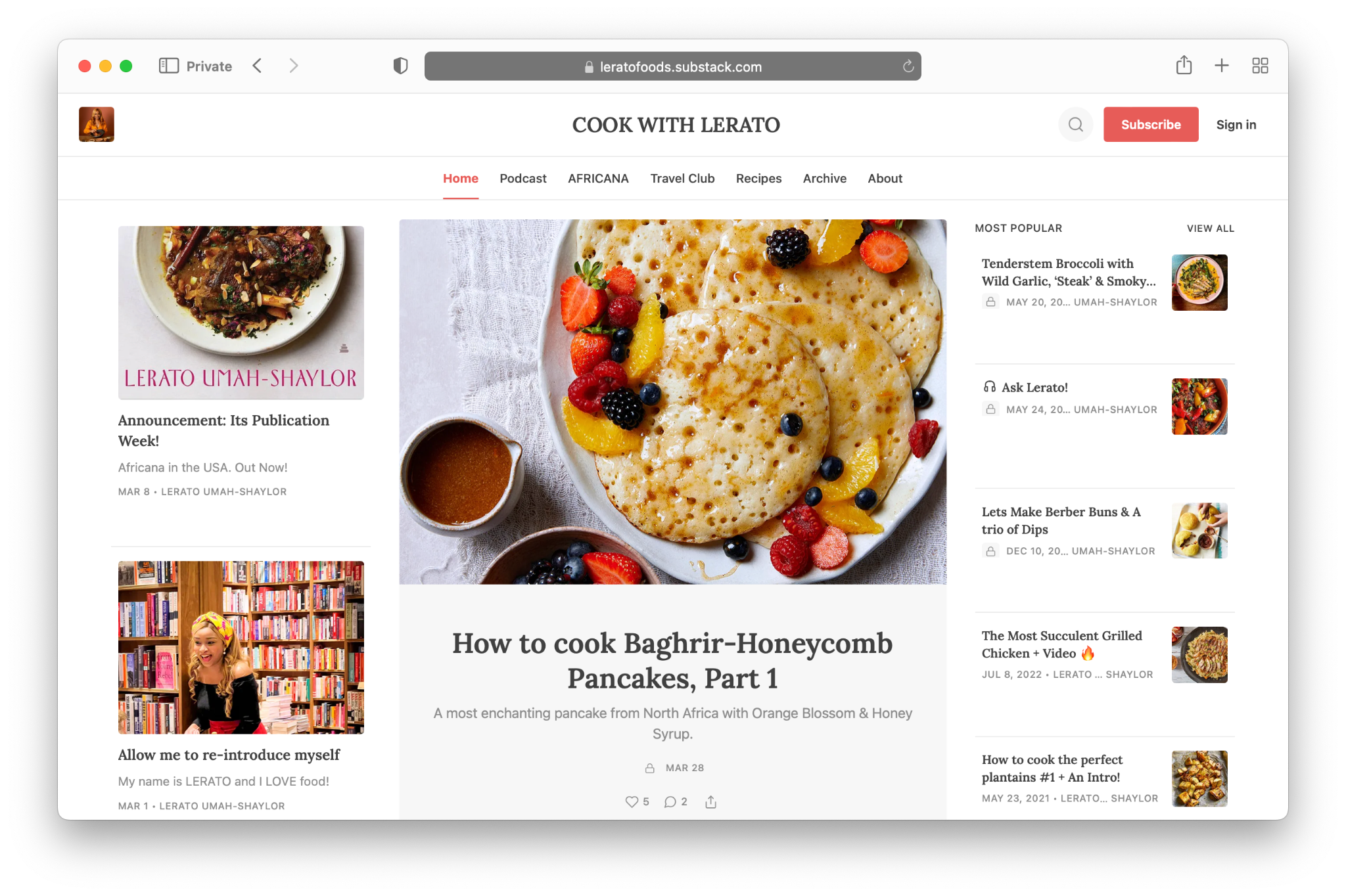
Lerato Umah-Shaylor uses beautiful food photography from her kitchen to bring her posts to life on Cook with Lerato.
Liz Plank uses a combination of personal and stock photos from Unsplash. You can add stock photos using Unsplash to any Substack post from image search in the editor.
Read more: How do I add free images or pictures to my Substack post?
Partner with an artist

Erik Hoel collaborates with artist Alexander Naughton to create a unique illustration for each post. Erik shared in an interview, “This creates an aesthetic for the entire newsletter, which in turn makes everything look more professional, which in turn builds the reader’s faith that you’re going to lead them somewhere interesting.”
The Microdose worked with a designer to create a logo and plug-and-play assets that they can use to showcase interviewees on the publication.

Tools
In this section we’ll review the following customization and organization tools:
Welcome page
Logo and wordmark
Social preview images
Site design
Layout
Color
Font
Navigation
Sections
Tags
Pages
Homepage links
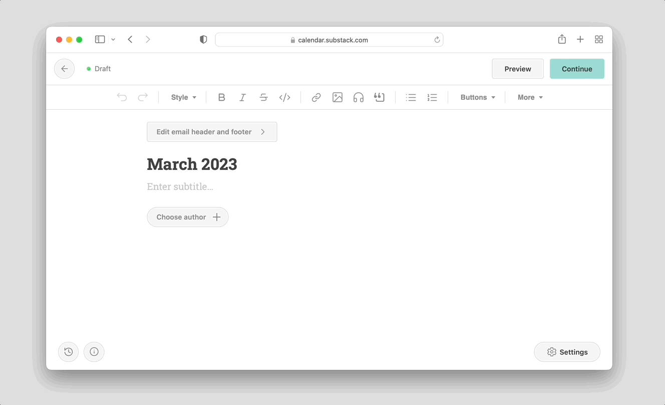
Welcome page
Think of the welcome page as your book cover. The welcome page default includes a logo, one-line description, the author’s name, a statistic about the publication, a button to subscribe, and a short information-collection disclaimer. Writers have the option to customize it further with a cover photo, background color, and Recommendations blurbs. Visit the Basics section in your settings to update.

On this page, focus on the one-line description. A great one-liner clearly and concisely highlights what your publication is and what differentiates it from the other newsletters out there. For some writers, that’s their years of particular domain expertise; for others, it’s their unique voice and personality; and for others, it’s covering a niche that nobody else can.
Your one-line description should speak to your target audience and emphasize the value they will get when they subscribe. The goal should be for a reader to see your one-line description and think, “That’s for me!”
Examples:
HEATED : “A newsletter for people who are pissed off about the climate crisis.”
Is My Kid the Asshole? : “Research-based parenting tips and insights to make your life easier.”
What To Cook When You Don't Feel Like Cooking:“One ridiculously impressive complete-meal recipe delivered to your inbox every Sunday morning that dirties minimal dishes and requires under an hour of time.”
Lenny's Newsletter: “A weekly advice column about building product, driving growth, and accelerating your career.”
You might make a stylistic choice to include your one-line description directly in your cover photo, like Judd Legum of Popular Information. In this case, you can hide the one-line description text from your settings and make the cover photo the main focus.

Read more: How do I edit my welcome page?
Logo and wordmark
A logo is your brand symbol and helps readers visually identify your publication. A wordmark is a text-based logo. Combined, over time these visual cues help subscribers recognize your work in the world.
There are no hard rules for what makes an appealing logo; it’s a personal choice. Follow your intuition and play with design to find something that feels like it matches your personality and is distinct.

Canva, The Noun Project, Flaticon, Looka, Logology, and Adobe Express all offer free or low-cost options for creating a logo.
Update your logo and wordmark from the Website section in Settings.
Social preview images
The social preview image doubles as the preview image on your publication site and the preview image of any link shared on social media or in text messages. The default is the first image in your post, but if you don’t have any images in your post or would like to select a different image, you can upload one from the post settings.
A good social preview image, like the title, should evoke curiosity and prompt the reader to click to read more.
A good social preview image, like the title, should evoke curiosity and prompt the reader to click to read more.
Site design
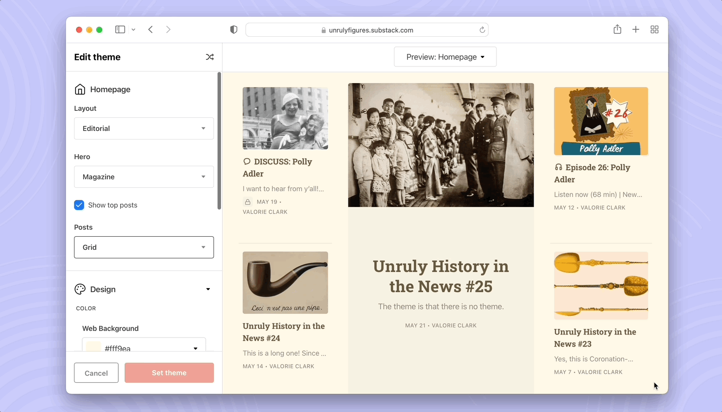
In this section, we’ll review how to update your layout, color, and fonts. You can update all of these elements from the Theme editor in Settings.
Layout
Our layouts were designed to be flexible and grow with you. You can choose more of a magazine look or a simple, sophisticated blog look.

There are three key layout components to choose from:
Hero: Your most important and newest post should stand out. Choose between feature, magazine, or newspaper mode to display your most recent or pinned posts.
Feature mode puts your single most recent or pinned post front and center. This is best when you want to draw visitors’ attention to one post above all else.
Magazine mode shows off five of your most recent and pinned posts. It is best for publications that are visual-forward.
Newspaper mode displays eight of your most recent posts, plus pinned posts. This shows the widest preview of posts.
Posts: Display your remaining posts in list or grid view.
List view offers a familiar reader experience that is easy to navigate.
Grid view suits highly visual publications with lots of images.
Top posts: Choose to feature top posts in a highlighted section. Posts are generated based on views, engagement, and recency. This gives visitors a flavor of your greatest hits and helps spotlight the best from your archive.
Update your homepage from the Theme editor on your Settings page.
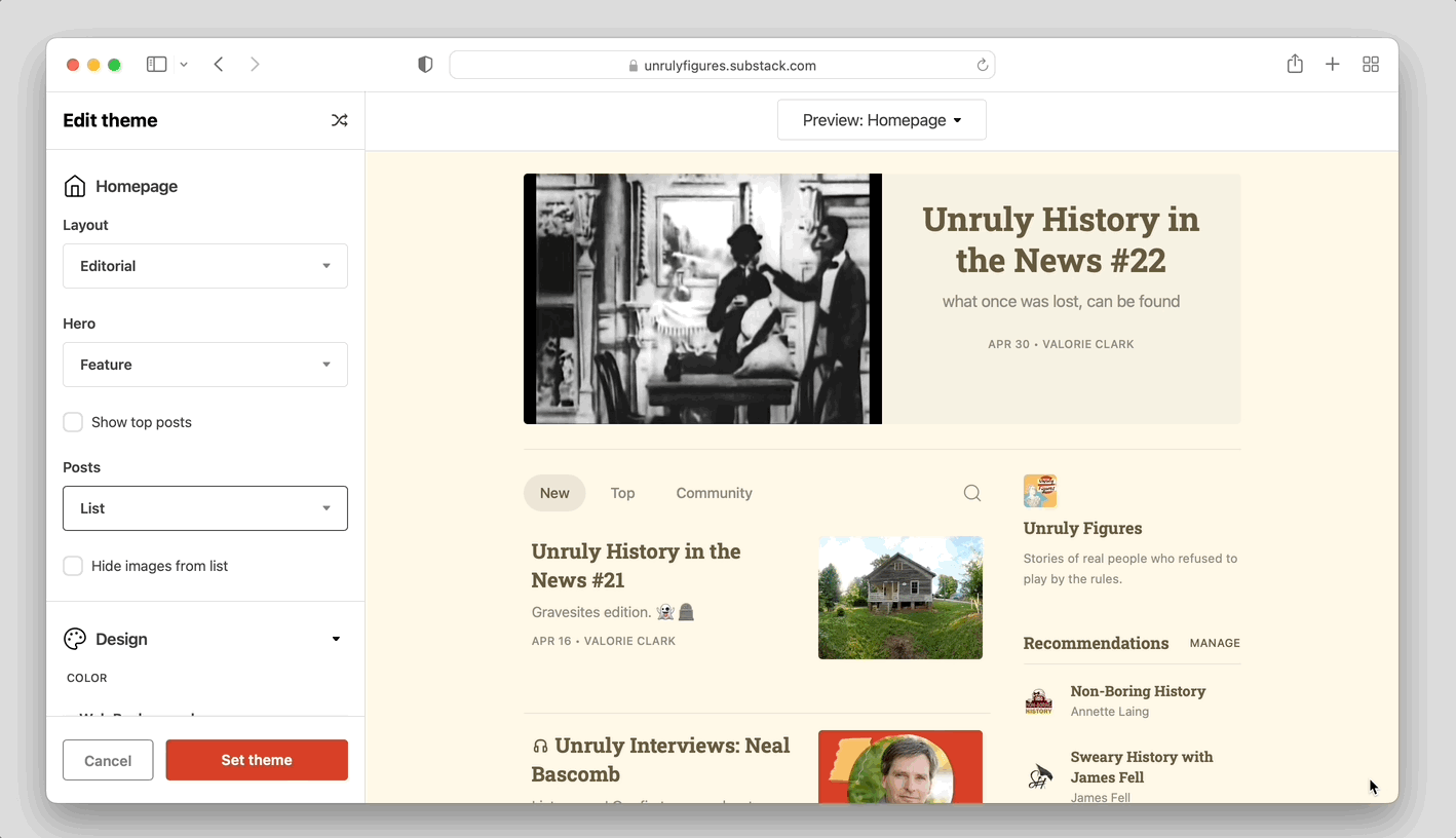
Color
From the Theme editor, you can also choose a background and accent color. Your background color will be the default on your homepage and all posts on the web. The accent color is used for things like buttons, pull quotes, and hyperlinks if you choose.

You want interactive elements, like buttons, to be highly visible. Choose an accent color that creates high contrast, making them stand out and easy to read.
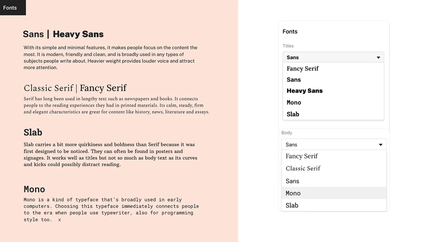
Font
Substack has intentionally added fonts to themes that are reader-friendly. Fonts can also be a stylistic choice. You have the choice between a handful of serif and sans serif fonts. Pick one that matches your personality.
Navigation
In this section, we’ll review sections, tags, and pages—the tools you have to organize your content.
Sections
As your publication expands to include more posts, topics, and contributors, Sections are a tool to create different mailing lists associated with distinct topics.
Each section will appear in a tab at the top of your publication’s homepage. Additionally, your subscribers can opt into or out of receiving emails for each section on their account page at yourdomain.substack.com/account.
Substack writers are using publication sections in a variety of creative ways.

Here are some examples to inspire you:
Burnt Toast: Podcaster and author Virginia Sole-Smith has a section for her podcast, essays, advice column, and behind the scenes of her latest book.
The Free Press: A publication with a high volume of posts uses a hidden section to send out roundups to subscribers. This allows the authors to send posts via email that do not show up on their publication website.
The Ankler: A multi-contributor publication covering the entertainment industry uses sections to separate the different beats covered by different writers.
The Charlotte Ledger: A local news publication has sections for transit news and obituaries.
Recommentunde: A comedy publication has sections for multiple podcasts.
Jatan’s Space: A science newsletter has sections for different space topics.
Read more: A guide to Substack Sections
Tags
Unlike Sections, Tags allows you to organize your work and make it navigable for readers without creating segmented email lists. Use tags to organize different post types, series, or beats.
Read more: How to tag a Substack post
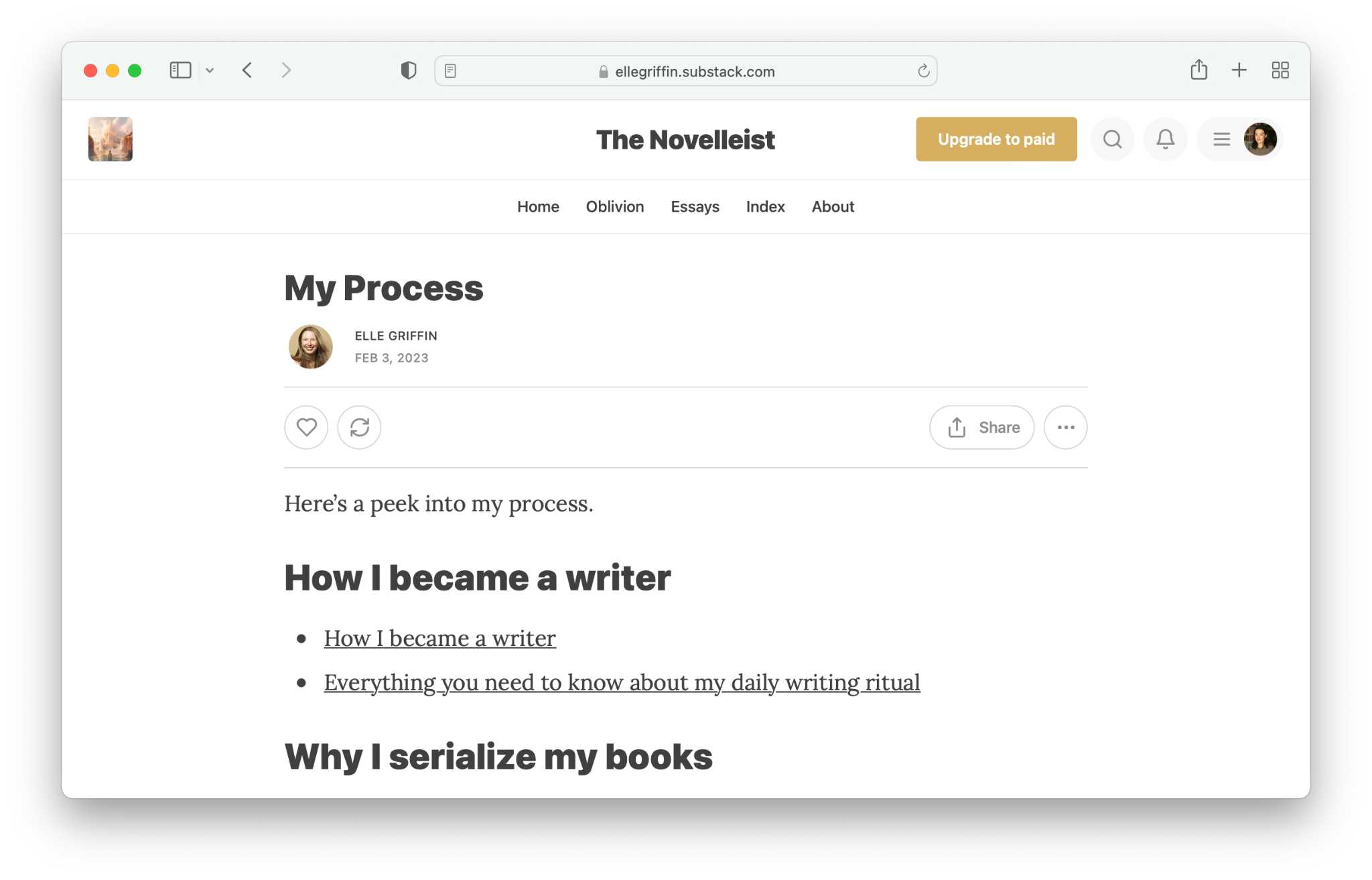
Pages
Pages are standalone posts hidden from your homepage that do not populate in your archive. Writers can use the link generated with a page just like any other URL link. You might use pages for marketing, to create a table of contents, to display community guidelines, or to share events.
Here’s how writers have used Pages:
Elle Griffin created a page that links to all her best posts about her writing process, which she is frequently asked about.
Astral Codex Ten uses a page to track mistakes made in past issues all in one place.
Navigation bar and homepage links
Sections, tags, and pages can all be added to your navigation bar at the top of your site or to homepage links on the right rail.

To update the navigation bar, head to “Website” in “Settings.” Hide existing sections and defaults, plus add unique links.
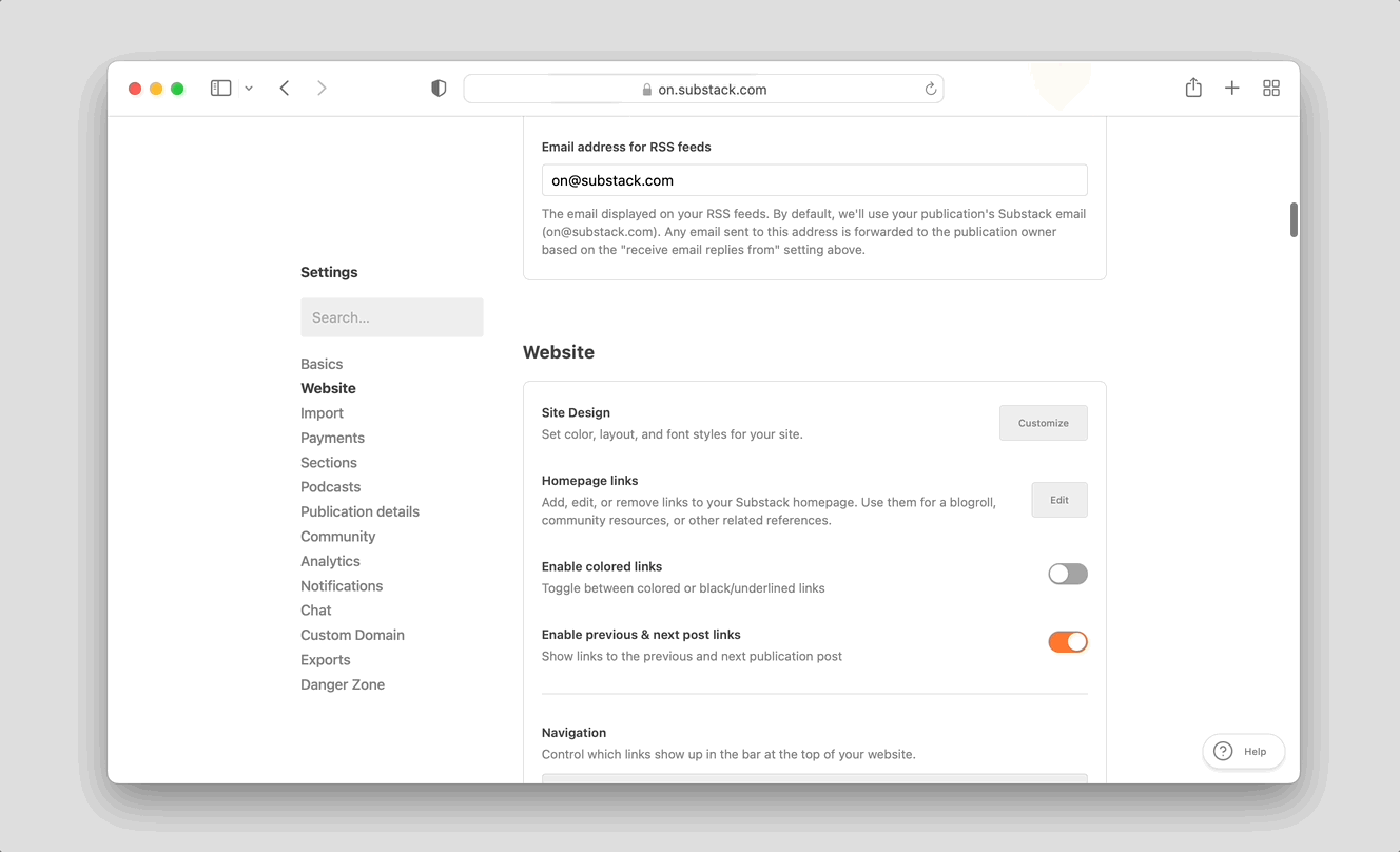
Homepage links can also be updated in the “Website” section under “Settings.” Writers use this to display a list of all their published books, social media accounts, resources, and posts’ greatest hits.

Additionally, tags can be used as headings on the homepage to help further organize your post. In the theme settings select “Groups (sections or tags)” and add the sections or tags you’d like to display as headings.

On Substack, writers earn a living doing what they love. Getting started is easy. Set up your website and paid subscriptions in just a few minutes.