
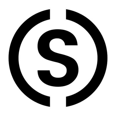
We’ve been going for almost a year and a half with a logo that was designed by Chris, our CEO, in Photoshop in about 20 minutes. It’s not especially sophisticated. It’s an ‘S’ inside a notched circle that kind of looks like a dollar sign. Because Substack helps writers make money. You get it.
But now we have a real logo, done by actual designers and informed by more than a passing thought. If we really put our minds to it, we could probably write a 14,000-word essay about the development process and its deeper meaning, but, just this once, we’ll spare you.
The new logo is pretty simple. The icon is a bookmark, indicating a choice you make when something is worth coming back to. We hope to help create things worthy of your bookmark.
At the very least, we hope you don’t hate it.
