Today we’re excited to share new ways to customize and organize your Substack homepage, giving you the ability to create a distinctive look for your publication without extra work. These updates are part of a series of ongoing aesthetic improvements we are making to Substack.
Part of the magic of Substack has always been how easy it is to start a publication—no tech or design knowledge required! While maintaining that sense of simplicity, we’re introducing ways to give you more customization where it counts so you can give your publication its own style.
New homepage layouts
We’ve been exploring ways to better support multifaceted media businesses (like The Free Press) and better accommodate high-volume publishing, multiple contributors, and publications that cover a diverse array of topics. One of the key requests that has come through in this effort, and among Substack writers at large, has been the ability to have more flexibility in how publishers can showcase their work. Today we’re introducing some new homepage layouts available to all writers on Substack.
The new homepage layout has three key components that you can customize:
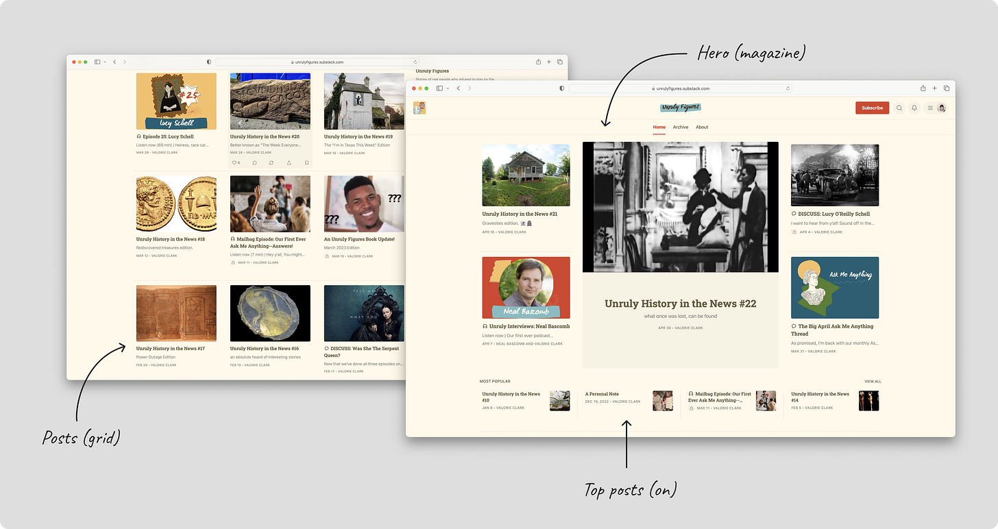
Hero: Your most important and newest post should stand out. Choose between feature, magazine, or newspaper mode to display your most recent or pinned posts.
Feature mode puts your single most recent or pinned post front and center. This is best when you want to draw visitors’ attention to one post above all else.
Magazine mode shows off five of your most recent and pinned posts. It is best for publications that are visual-forward.
Newspaper mode displays eight of your most recent posts, plus pinned posts. This shows the widest preview of posts.
Posts: Display your remaining posts in list or grid view.
List view offers a familiar reader experience that is easy to navigate.
Grid view suits highly visual publications with lots of images.
Top posts: Choose to feature top posts in a highlighted section. Posts are generated based on views, engagement, and recency. This gives visitors a flavor of your greatest hits and helps spotlight the best from your archive.
Together, your choices for each component will create a unique layout for your publication. Plus, the design sets the foundation for us to add more components for you in the future, like marketing blurbs, podcasts, and video spotlights.
Update your layout from Site Design under Website section in the Settings.
Read more: How to change your homepage layout
Tags
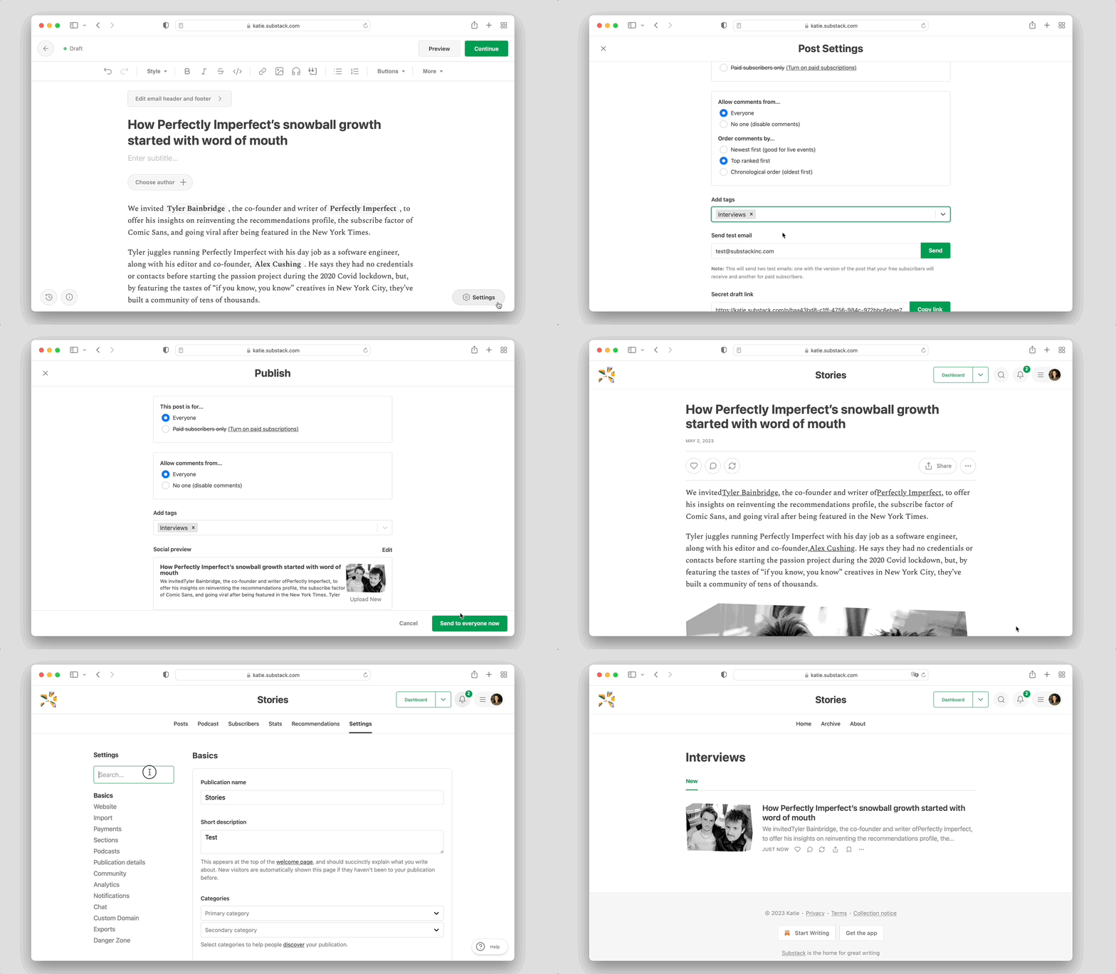
Additionally, we’re introducing the first version of Tags to help organize your posts. You can now add a tag to any post and link to that tag from your publication’s navigation bar or your Homepage links in the right rail. Unlike Sections, Tags allow you to organize your work and make it navigable for readers without creating segmented email lists.
Read more: How to tag a post
More customization and organization tools
Homepage layouts and Tags add to a growing set of tools that help publishers customize and organize their work on Substack.
Add polish and personality to your homepage:
Design: Add color to your site’s background and accent it. Plus, pick a font that matches your writing’s personality.
Logo and wordmark: Establish your brand with your logo and a wordmark featuring your publication name.
As your publication expands to include more posts, topics, and contributors, here are the tools available to you to create an easy navigation experience for your readers, in addition to Tags:
Sections: Create different mailing lists associated with distinct topics. Subscribers can choose to subscribe and unsubscribe to different Sections.
Pages: Create standalone posts hidden from your homepage and that do not populate in your archive.
Navigation bar and Homepage links: Sections, Tags, and Pages all have unique links that can be added to your Navigation bar or Homepage links. Visit the Website section in Settings to update.
Read more: A guide to customize and organize your Substack website
These improvements mark the beginning of a series of updates we’ll be rolling out over the coming months to offer publishers more customization controls. We hope you give these new tools and features a try. As always, please feel free to leave feedback and ideas in the comments.


