In part two of our series on building an editorial strategy, we look at how designing formats for your publication can create consistency, and a returning readership. Visit the full series.
In part one of our series, we helped you get clear on your goals. We answered the questions: Why is this work important to you? Who might your audience be? And why will it matter to them?
In part two of our series on building an editorial strategy, we’ll help you answer the next question: What will you publish? Writers who cultivate a repeatable format for their work not only stand a better chance of being read, but defining regular series can help flesh out your content calendar—and create a consistent writing habit.
“A blank page can be crippling for some, so having a format, even a really light one, asks something of you,” Hugh Garry of Formats Unpacked shared with us.
Whether you’re looking to create a tight, crisp, repeatable format you can sell to subscribers or ideas for experimentation, this post will offer you inspiration to get started.

What writers, creators, and podcasters are publishing
The possibilities for how you use the Substack post types are endless. Figuring out how you are going to fill the page week after week can be exhausting, and when the format takes new shape every week, it doesn’t offer an ideal experience for your reader.
Hugh reminds us, “It’s hard enough getting attention for your newsletter, so when you get it, you want to hold it. That’s what formats do. They give your readers a reason to return before you’ve even decided what you are going to write next week or the week after.”
You don’t have to write a full article or longform essay each time you publish. Instead, here are some inspiring formats from across Substack:

The links roundup: Share a number of out-links to notable reads, listens, and videos online. These can follow list formats or be written into prose.
Examples: Caitlin Dewey, Haley Nahman, Helen Lewis, Ryan Broderick, and our own Substack Reads

The curated list: Play with themes and ideas, and share loose, related ends in a readable digest.
Examples: Jenny Walton, Alisha Ramos, Becky Malinsky, and Lev Parikian

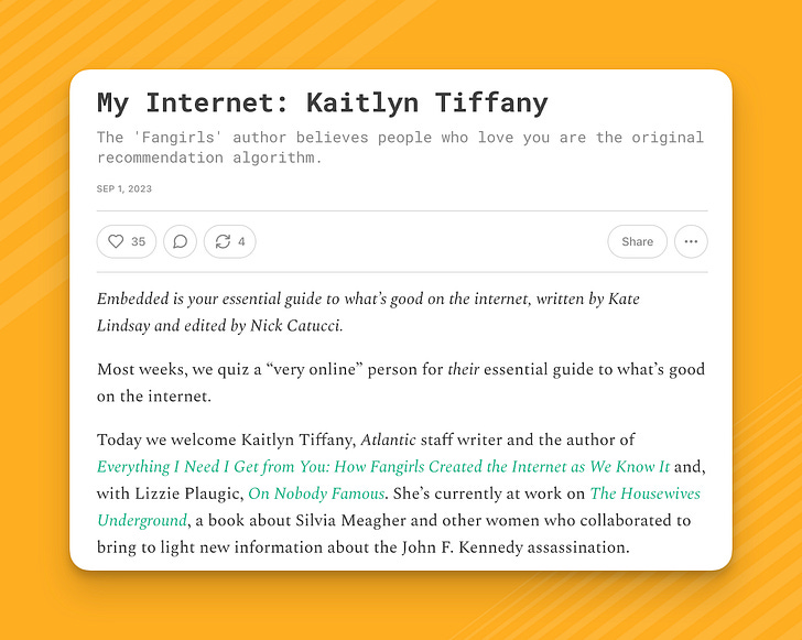
The Q&A: Many writers opt for interview formats that are easily read in email inboxes—such as a Q&A style, using heading fonts to switch between speakers. You can source the answers via email or using a tool like Google Forms, or jump on a call and transcribe the conversation.
Examples: Embedded, Jane Ratcliffe, Oldster Magazine’s questionnaire, and our Grow interview series

The photo essay: You don’t have to be a full-time professional photographer to adopt a photo-essay format that resonates with readers.
Examples: Chris Arnade, and Dina Litovsky for photography, while Alex Elle and Samantha Dion Baker mix images and illustration.

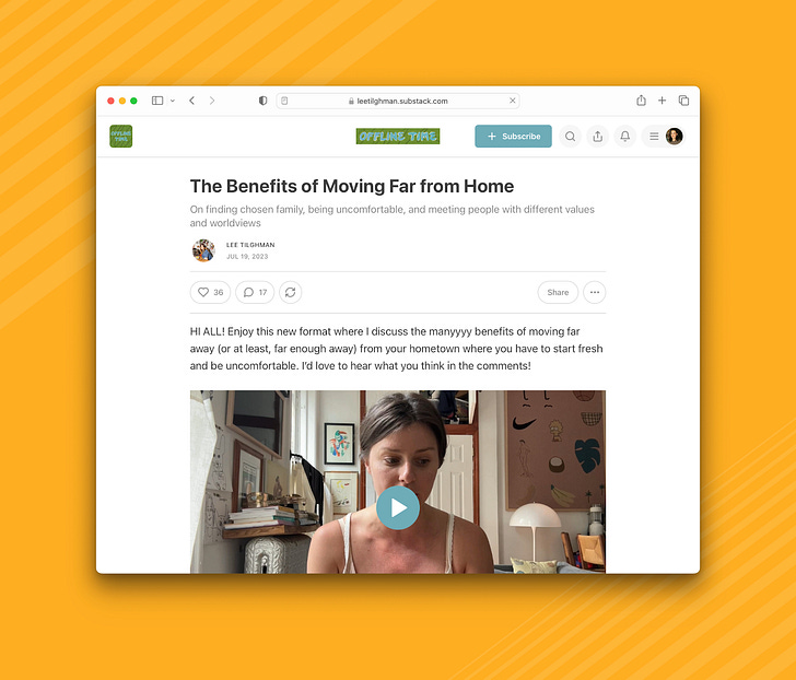
The vlog: Substack offers both video posts and video embeds. Writers use video to talk directly to subscribers, read their own essays, and more.
Examples: Patti Smith, Elizabeth Gilbert, and Lee Tilghman

The voice note: Like a voicemail in your inbox, some writers opt to check in with readers between longform posts with casual voice-note updates using the voiceover or audio embed feature.
Examples: Jeff Tweedy and Meg Conley

The “out of the box”: Writers, artists, creators, and podcasters go beyond traditional formats to create engaging experiences for readers publishing games, serializing novels, hosting book clubs, and more.
Read more: Creative ways writers publish on Substack

Putting formats into practice
Whether you choose one distinct format or mix and match a few in your flagship posts, design choices can help create visual consistency for your readers and give you a template for filling the page. They also help give your publication a unique style.
Let’s take a look at how writers templatize their posts, use titles, images, headings, and some lightweight promotional prompts to help their posts travel further.
Titles
Titles and subtitles are the first entry point for a reader into your posts. Farrah Storr from Substack’s partnerships team, and the former editor-in-chief of Elle and Cosmopolitan UK, says:
The job of a headline is simple: to make people want to read your story. That’s it. And yet they are so hard to get right and so very easy to get wrong.
Sometimes writers use the beginning of their title to name the format or series. It’s best to keep series or format titles to one or two words and, if it’s a branded name like “My Internet,” written by kate lindsay and Nick Catucci, include a short intro at the top of your post reintroducing the format style.

The rest of your title you can think of in two parts:
Title: The showstopper—the hook to stop people in their busyness.
Subtitle: The sell—the vehicle to move the story forward. What writers most often get wrong is that they repeat themselves in the subtitle. Instead, how might you use this precious real estate to convince people they care enough to spend a few minutes out of their busy day reading your work?
Images
A standout image at the top of your post helps create intrigue and works with the headline to draw people in. This image also doubles as your social preview image that will display as the preview on your publication homepage and social media.
Mixing images and illustrations throughout can help bring a post to life. Some writers even create a little library of elements that they overlap on new images to create a distinct look, or motifs they add as section dividers.

Check out some interesting visual examples:
Luca Rossi creates handmade charts for Refactoring posts using recurring colors.
Leslie Stephens uses overlay text on photos and custom image headings to bring morning person together.
Samantha Dion Baker mixes illustrations into her essays, building a unique personal format.
Headings
Headings can be a great way to split your format into multiple parts. For example: you might start with an essay or article, followed by a links roundup, or “in case you missed it” sections. Use headings as markers to let readers know you are transitioning to a new part of the newsletter, or when a new idea or format is being introduced. Plus, you can use headers as scaffolding in drafts while you are creating the post.
Promotion prompts
Every time you publish, it’s an opportunity for existing subscribers to share your work so new readers bump into it.

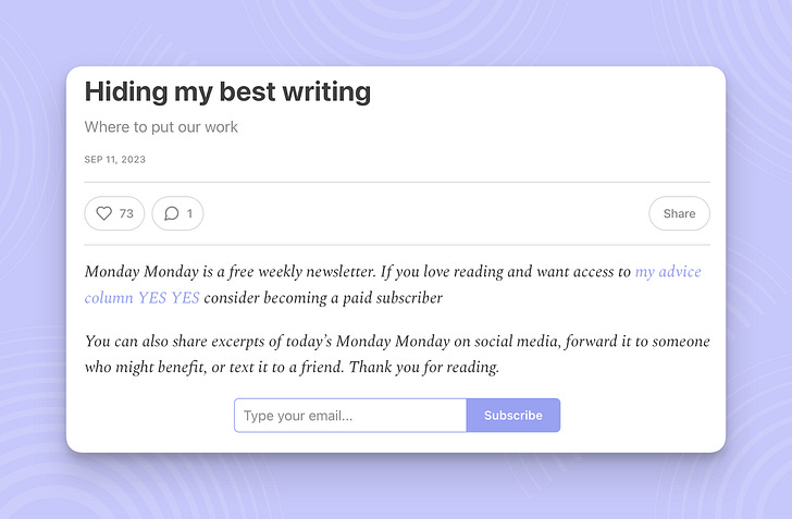
Headers: Headers can be an effective driver of new subscriptions from those who came to the post beyond the inbox. Writers use them as a chance to remind readers what the publication is about, and prompt new readers to subscribe in case the post was forwarded to them from a friend.
Examples: Anne Helen Peterson, Luca Rossi, and Marlee Grace

Footers: If a reader made it to the end of your post, chances are they might be compelled to engage further. Use buttons encouraging them to share, subscribe, or comment. Promote recent or relevant posts, especially your paid posts, so that readers can keep reading if they’d like. You can even preview what’s coming next week.
Examples: Alex Debrenko, Haley Nahman and Lenny Rachitsky

Paywall: Once you hone your style, you might find that a specific element you offer is what people value most. For example, people love Leslie Stephens personal essays. So, each week Leslie sends out her flagship post which includes three recommendations followed by her essay. Everyone gets a free preview showing the recommendations but the essay is below the paywall. The free preview allows your best writing to do the marketing for you, without extra work.

Pro tip: Once you publish a post in a format you like and want to recreate, you can duplicate the post, edit it in your post drafts, and use it as a template. In the post three-dot-menu, click “duplicate to drafts.”
Learn more.

What formats are you inspired by? How did you devise your format for your Substack? Keep the conversation going:

This post is the second in a series on building an editorial strategy to create a consistent writing habit. Check out the first post on setting goals, and look out for the next post tomorrow, on creating consistency.
