


New ways to customize your Substack
Introducing new homepage layouts and tags
Today we’re excited to share new ways to customize and organize your Substack homepage, giving you the ability to create a distinctive look for your publication without extra work. These updates are part of a series of ongoing aesthetic improvements we are making to Substack.
Part of the magic of Substack has always been how easy it is to start a publication—no tech or design knowledge required! While maintaining that sense of simplicity, we’re introducing ways to give you more customization where it counts so you can give your publication its own style.
New homepage layouts
We’ve been exploring ways to better support multifaceted media businesses (like The Free Press) and better accommodate high-volume publishing, multiple contributors, and publications that cover a diverse array of topics. One of the key requests that has come through in this effort, and among Substack writers at large, has been the ability to have more flexibility in how publishers can showcase their work. Today we’re introducing some new homepage layouts available to all writers on Substack.
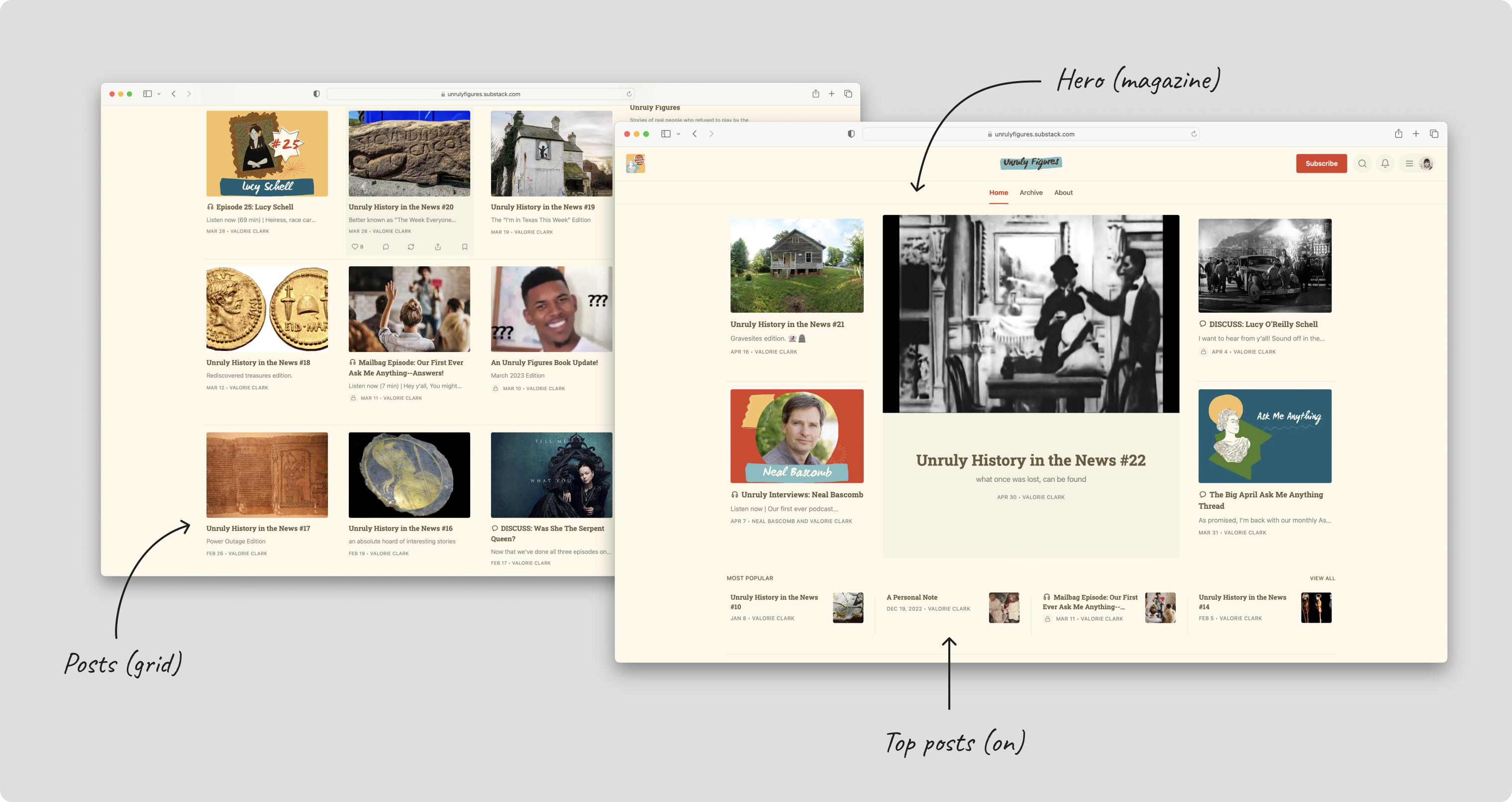
The new homepage layout has three key components that you can customize:
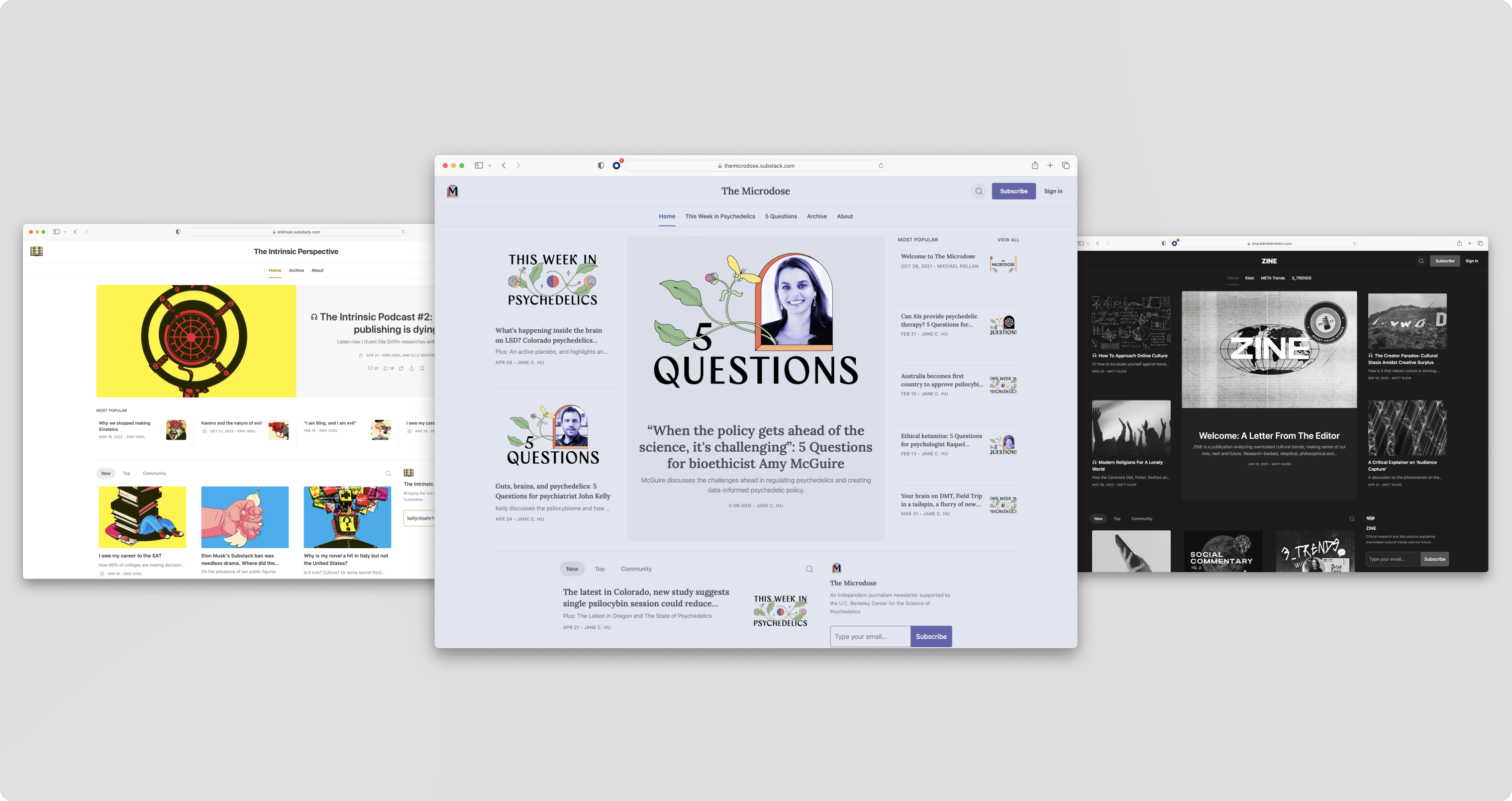
Hero: Your most important and newest post should stand out. Choose between feature, magazine, or newspaper mode to display your most recent or pinned posts.
Feature mode puts your single most recent or pinned post front and center. This is best when you want to draw visitors’ attention to one post above all else.
Magazine mode shows off five of your most recent and pinned posts. It is best for publications that are visual-forward.
Newspaper mode displays eight of your most recent posts, plus pinned posts. This shows the widest preview of posts.
Posts: Display your remaining posts in list or grid view.
List view offers a familiar reader experience that is easy to navigate.
Grid view suits highly visual publications with lots of images.
Top posts: Choose to feature top posts in a highlighted section. Posts are generated based on views, engagement, and recency. This gives visitors a flavor of your greatest hits and helps spotlight the best from your archive.
Together, your choices for each component will create a unique layout for your publication. Plus, the design sets the foundation for us to add more components for you in the future, like marketing blurbs, podcasts, and video spotlights.
Update your layout from Site Design under Website section in the Settings.
Read more: How to change your homepage layout
Tags
Additionally, we’re introducing the first version of Tags to help organize your posts. You can now add a tag to any post and link to that tag from your publication’s navigation bar or your Homepage links in the right rail. Unlike Sections, Tags allow you to organize your work and make it navigable for readers without creating segmented email lists.
Read more: How to tag a post
More customization and organization tools
Homepage layouts and Tags add to a growing set of tools that help publishers customize and organize their work on Substack.
Add polish and personality to your homepage:
Design: Add color to your site’s background and accent it. Plus, pick a font that matches your writing’s personality.
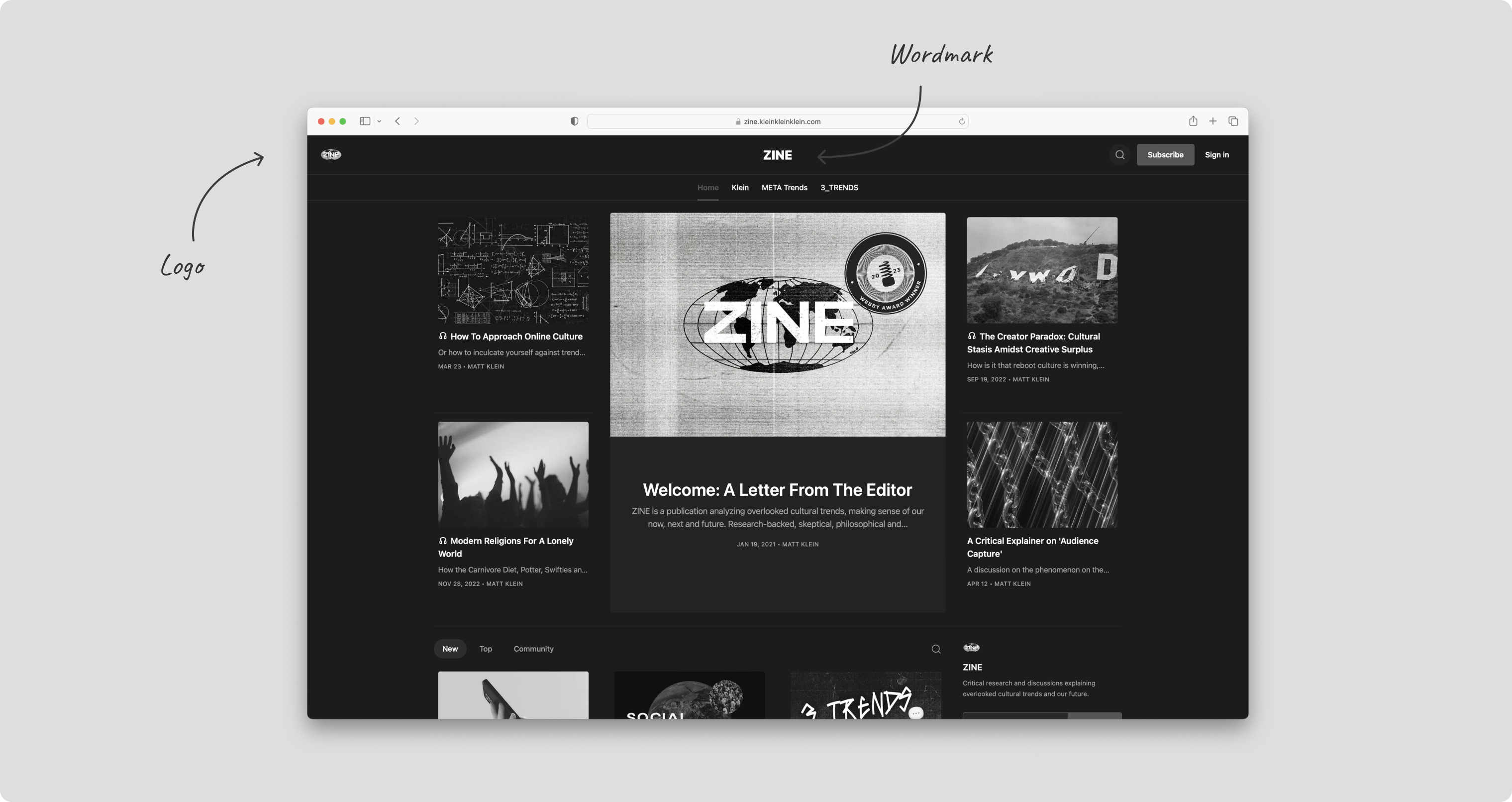
Logo and wordmark: Establish your brand with your logo and a wordmark featuring your publication name.
As your publication expands to include more posts, topics, and contributors, here are the tools available to you to create an easy navigation experience for your readers, in addition to Tags:
Sections: Create different mailing lists associated with distinct topics. Subscribers can choose to subscribe and unsubscribe to different Sections.
Pages: Create standalone posts hidden from your homepage and that do not populate in your archive.
Navigation bar and Homepage links: Sections, Tags, and Pages all have unique links that can be added to your Navigation bar or Homepage links. Visit the Website section in Settings to update.
Read more: A guide to customize and organize your Substack website

These improvements mark the beginning of a series of updates we’ll be rolling out over the coming months to offer publishers more customization controls. We hope you give these new tools and features a try. As always, please feel free to leave feedback and ideas in the comments.


While I appreciate the new tools, please keep this in mind: The reason Substack felt like safe harbor for writers like me, is that it was only about the writing. It's not just that you don't have to worry about design or that design is easy. It's that you don't have to feel obligated to make your writing prettier, or spend time doing the self-promotional stuff that distracts one from the focus on the work. It is great to be able to chat with people and read notes, but I already feel the need to acquire "likes" and such. It's the pull of that dopamine hit of approval. Please don't become every other social media platform. There are lots of places for visual content, or even snappy banter. This is the only place that's really about the writing. I'm not saying don't add features. Just please be aware of what you risk losing. Thanks.
Not to disagree, as I agree with simplicity, but I do appreciate being able to choose page colour, font, and basic layout, from some simple options. I also write to pictures, in my work, so they are crucial for me. I do my best to describe what a clearcut does to an ancient forest, but pictures are still vital. cheers
I'm cool with some limited options for making stuff look good, so long as it remains easy for the average writer who doesn't write CSS code. It's the "get out there and plug your stuff in the social media notes" that bothers me. I really loved it when the only way to increase your audience (at least inside Substack) was to write things that people felt worth sharing and recommending. It was kind of pure in a world where the only talent valued is the talent for self promotion.
Just today, I mentioned your exact comment about "the writing being the heart of it" to a writer friend of mine as a reason she should check Substack out. She was very moved by your point. You have a friend you haven't met yet, for life, lol.
I'm really happy with Substack, for exactly the reason you said. Priorities are right, and it makes it easy for non-tech people to blog really clearly and well. I don't have any Social Media myself, not even FB. However, I recognise that SM (Ess and Emm, lol), can be good ways to get excellent pieces of writing through the Dominant Society Filter to find new people. Cheers!
As an artist, I'm much too concerned about prettying up my page and have found I will eat up my nights messing with stuff. I'm enjoying the restraint of just a few options.
second this 100%. I fled social media for substack. it’s still a safe place, but all the new features are beginning to threaten its untouchability
I couldn't agree more, Esther. Lots of new features and bells and whistles make me worried that I'll be spending too much time with them, whereas for me, it should really be all about the writing!
Thank you, totally agree. The pull of likes is so toxic. I try to justify that "I'm growing my newsletter" but am I really? Even new subscribers you "collect" here, if so lucky, aren't necessarily really reading. I think the real readers will find their way if we are free to just focus on the good work of making good writing, end of story. (I do like to make things prettier though since I'm very visual and love design, it's the social pressure component now that worries me.)
Yeah, that's the problem with pure numbers. You can have X subscribers, but how many are really reading? For my part, I want readers, not numbers.
I see the changes happening here which are focused on numbers, metrics, etc. without considering if this produces engaged readers or just a higher dot on a line chart. It concerns me because Substack was great, focused sharply on delivering writing to folks.
I find the movement toward social media not so welcome. However, I understand it's probably inevitable because the #1 rule of tech is that you can never let a good thing be.
Once my email open rate drops below 40% I actively delete those who aren’t engaging as it’s just demotivating.
IDK. In my experience as a reader, don't lots of folks subscribe just for access and then go straight to the site themselves (instead of messing with emails)? That's what I do. My inbox is overcrowded already with subscriptions. I just go to those sites on my own after I've signed up.
That is EXACTLY what I do as well. Thanks Christiaan, for bringing that up. How do I know when my readers area actually reading?
They tell me in the comments and invite more people/share the content. If there's another way to tell, I don't know what it is yet.
I do the same thing. Keeping the open rate high is the real dopamine hit for me.
Vanity metrics otherwise if no-one is engaging.
Truth!
I totally get what you're saying, but I'm elated that Substack has added these features. I hope it adds more. I literally just started an account as a creator, and I probably wouldn't have done so if it didn't have these features.
The added features are actually really basic, and I have no doubt that quality writing will remain the primary focus. It is central to Substack's identity. More features that promote creativity, expressiveness and practicality won't change the focus. They simply allow creators to further personalize the pages (if they choose to) and better organize their posts for presentation to their readers.
For example, adding sections and tags were key points for me. And being able to have my own logo and other customizable options were very important. I ran a successful blog/multi-page website for three years in the late 2000s, and the appearance and versatility of the site were high priorities for me — even though excellent writing was the main attraction. I'm not quite as concerned about site design now as I was then, because it can be time-consuming, but I definitely want some legit flexibility of design and organization. I want the options.
I'm sorry that you feel pressured or obligated by the changes. I think having more ways for creators to express themselves is a positive thing. And folks want some tools to help their sites get found. It doesn't mean everybody has to employ all these features. Just keep doing you.
Personally, I'm not at all concerned about Substack turning into Facebook, Twitter, Insta, etc. It's a whole different animal. And I couldn't care less about the "like" button at this point. It's pretty standard everywhere nowadays, like cruise-control in cars. The real "like" button for Substack is subscribers and views.
Quality content will always win the day. If the work isn't good, people aren't going to stick around, come back or sign up — no matter how flashy the site looks or how much traffic flows through.
Hell, I should have read further down before repeating a lot of what you just said...HAHAH. With you 100% -- and I'm new here also. For me it was "just" enough customization but not so much I have to maintain/update things.
I wanted to set everything up, make sure the reader experience will be good (sections/tags), make it mine with custom art -- then create. Just write, draw, podcast...and be consistent.
All Substack would have to do is add the option of multiple tier options and I believe this would be the dominant writing platform on the internet.
It's crazy that Substack is still missing some incredibly BASIC features, which is frustrating. I mean, we can't even wrap text around a picture (which is the most basic thing ever for any webpage). All pictures have to be centered with no wraparound. Like, really?!?
I hope they keep adding design features (at least add the frickin' basics) and also more traffic-generating features. If they do so, I agree that they could dominate this arena of the internet.
There's no reason for Substack to be so limiting. Its business model — the underlying architecture of subscriptions, email marketing, a content-centric framework, serious creators, and the wonderful Substack community, etc. — would be unaffected and remain intact.
Those building blocks are the main draw of Substack in the first place (which made many of us forgo other platforms that offer more design features, SEO, etc.), so why not enhance it and give creators here more options? Quality content and Substack's foundational values would still rule the day.
Plus, *design* is a form of content in and of itself! (Of course the writing and/or visual art centerpieces would still have to be compelling to gain and retain an audience.)
BTW, your site looks AMAZING,!! Incredible. You are massively talented. I can only imagine what it would look like if Substack wasn't so limited in design capabilities, because what you've done is absolutely fantastic!
People should check it out. (And it might help them understand what you and I are talking about.) Truly unbelievable!
I have yet to officially launch my site (which will be quite different and paired-down compared to yours, like a totally different vibe and focus. Hopefully it will happen by the end of the month or early next month.
Anyway... I really was blown away by your site! For folks reading this, check out his site here:
https://www.lifeoffiction.com/
I'm just curious, because I do some cartooning, do you draw on a computer program? My cartoon drawing certainly isn't at the level of your artwork, but I'd like to be able to create in a way that translates to digital platforms. Do you need a touch-screen computer or accessories for drawing/painting? For example, how do you fill colors in spaces so precisely? Do you have to do all of that manually or is there software that you work with?
First off, you might hate me for this, but I’m actually going to side with Substack on NOT allowing the wrap around text...because I just discovered /noticed something you may also appreciate...
I had several friends look up LifeOfFiction.com on their phones and they each saw the EXACT SAME THING.
Now, when they go to WantedHero.com which is my wiki-on-cocaine connected to LifeOfFiction.com, they each get jumbled results...because they each have a different screen size.
My site doesn’t render equally, BECAUSE of wrap around text. Some phones look horrid -- with a single word scrunched next to a pic, and it throws it all off.
Once I saw that? I get it. This is perfect. It’s not “everything” but it makes my Substack look good on ANY device.
So consider that.
As for the art, thanks. I appreciate the compliment. I need to put up a lot more art, but it’s coming.
As for the art itself, I used to be old school and then scan it all in, adjust in PS,...but I’ve since learned to hate Adobe and THEIR subscription model. After more than 15 years I dropped them and went with Affinity software from the UK.
Infinitely better, you own it, no internet connection required, $75 per software. They have the equivalent to Photoshop, Illustrator, and InDesign. I used all three, replaced all three about 4 years ago,...beat decision ever.
How I MAKE the artwork:
IPad and ProCreate. Bought them 7 years ago...haven’t killed a tree since.
Unlimited YT videos and programs to learn the software. It’s $12. That’s it. Walks over other programs without breathing hard. Exclusively for the iPad....so treat yourself to a big iPad.
I bought a used 12.9” Pro for $1100 with 1TB storage. Procreate allows layers depending on your storage space. So go big. You won’t be disappointed.
Thanks for software insights! Much appreciated. What platform did you use for your other site? I had a site 10 years ago through WordPress.ORG and wraparound was no problem across devices and browsers. It was always consistent, bc I used templates that were designed for both laptops and mobile/tablet devices. (And wraparound works perfectly fine for professional sites.)
That's why I'm surprised the Substack platform doesn't even include it. It's included elsewhere with no issues.
The problem with WordPress (whether it's .org or .com) is that you have to do so much of the heavy lifting on your own with coding and plugins.
I definitely hear what you're saying about wraparound text and consistency across devices and browsers, but it's very commonly featured on many platforms.
All I'm saying is I want some more options, which should be doable by Substack. And, like I said, there are lots of pros to Substack that outweigh some of the cons. I just get a little frustrated sometimes.
No, I get it -- I really do.
First off, I always used Wordpress, and still do for other business, like https://JaimeBuckley.com for artwork. Yes, the heavy lifting can be rough -- which is one of the main reasons I came here. I was tired of the work, the maintenance, and the constant hacking by people wanting to take kids reading my comics to porn sites was the last straw for me.
The mobile versions of site are common, yes, but they still (most I experience) still look questionable on my little iPhone screen. So there's definitely an argument for both sides.
But I'll say something that won't likely be brought up -- and that is keeping an impressive light on Substack...
Having the ability to custom design a site doesn't mean you should. It's like having a builder that can design the most structurally sound building, but he/she has ZERO design sense. The only thing you get in the end is an eye sore that will...never...die.
IMO Substack has created quite a perfect balance, because no matter who you are, I don't think you can screw up your own stack visually.
It might not be as visually stunning as, say a photographer displaying their skills, but you won't make the community look bad, either. That, for me is important. Snobbish of me, YES, but important.
Thing is, the moment Substack makes that change, and maybe it's what you want for your site/stack,...it also affects mine.
Forever.
So though I see your point (and I don't disagree with you either), PLUS I have a wish list myself, I've experienced far too much to inflict what I want onto the whole community. This is me, just saying I get why Substack is being cautious, and maybe, just maybe, we can't see the over-arching decisions, because this isn't my business.
SS has more than two cartoonists to take into consideration (grin).
Doable isn't the same as 'should'.
When I came to that conclusion, I asked myself, "Does NOT having such-and-such a feature make the platform less effective?"
The answer for me was "no".
...so I started building.
Hope that makes sense?
Makes sense, but I have confidence in my design abilities. And people can always just flip to the next Substack site if they don't like one or another. (I mean, some Substack sites contain borderline hate-speech, which I find more offensive and polluting than any sort of tacky design could ever be.)
Plus, the main reason I came here, aside from Substack's business model, was because I didn't want to be tied up with design and other features (because I could happily spend endless hours tweaking and perfecting those aspects). I wanted to primarily focus on my written content without getting sidetracked.
Like I said, I'd be happy if Substack just added a few more basics of design/features. I'm not asking for it to be Wordpress. Just some more of the basics.
Anyway... I enjoyed checking out your business site. Pretty awesome.
I get it. Like I said, I don't disagree with your points,...I could make them sing also. For me, it's only about how does it affect us as a whole.
Each feature will, in fact, hold all of us up to a flame...or maybe I should say, a flashlight...and then we will be compared in different ways.
That's precisely why those features are important to artists like us, though, right? Yeah, so I get it. For me, I think there's a good balance right now...and I'd love some clever ways to grow an audience tacked on instead.
I have a first tier goal of 3000 paid subscribers, then I'm happy to talk about everything else.
Hey Jaime, looks like your site is coming along great! I was just curious, how do you make some photos/artwork within posts go all the way across the screen (beyond the horizontal parameters of the text blocks for each post)? I noticed it on your site and a small handful of other sites.
On all artwork you post, if you hover your cursor over the top right corner of the art, a small bubble with 3 dots will appear. Click that and you'll get the options for 'alt text', etc...but you'll also see an option to widen the art to "large" or I believe "full-width".
Sweet. Thanks! Not sure how I missed that.
Wrapping text doesn't require knowing code. It just means your image can be on the left or right and text will "wrap" or continue on either side of the image. It can save space, looks nice and allows for smaller images. So basic. I wish Substack had it.
Yes I agree. I’m no techie and don’t want the extra headache of it not being shiny enough.
I so much agree with your POV. I was on a month-long hiatus from Substack and upon my return, I couldn't help but wonder, "is it the same Substack?" Yes, adding new features and updates is cool... until it eludes the core of the craft--writing.
I'm with Antonia. I really like to read and write. I'm not into web design.
I totally disagree. Now we can do podcasts and video. Change is the only constant, Grandma.
You know what they say...you can't teach an old dog new tricks. You can, however, continue feeding it, bathing it, and petting it.
I'm torn here. I agree with you wholeheartedly, Antonia...fled social media and my own websites, leaving all the complicated stuff behind. Thing is, I'm a cartoonist, so visual features are critical for me.
Again, I'm with you about the CSS code also...I was compelled to learn it for my other site. I just want to write, and compliment my writing with my own artwork.
What I appreciate about Substack, is it's all buttons and simple choices with customization. That's all. There's no code to worry about. It's just a combination of choices to make things look prettier. IF you want it.
It allows me to use my art in a better way, so potential readers can easily find me through a comic strip...
This is me saying I agree, but there's more to it. The powerful automated way our Substacks sell, upgrade and help us is, IMO, second to none and I'm delighted to be here. These changes, as I see it, support your point, not hinder it.
But that's me.
Great advice. If you’re looking for more brilliant wisdom, advice and general, all-round genius, may I suggest a visit to danielpiper.substack.com
Your posts make my day 😂
Many thanks, fan.
You’re not the real one, are you
Yours is by far the funniest Substack I’ve come across.
Many thanks, fan.
Do you mean advice on home-page layout?
I mean advice on life, love and love life.
Where are my socks?
Hehe,...I keep a bottle of Writers Tears on my writing desk, right next to the Smokey Tennessee Whiskey...and a 13" hand-carved statue of Jiminy Cricket.
Sections in Substack have always been a bit confusing to me. Most subscribers don't care enough (for or against) to unsubscribe or resubscribe to a particular niche topic of my writing. I'm glad to see that tags are now an option for people to easily sort or read only about a specific topic without the confusion of what they are or aren't subscribed to.
I tend to agree with you on "Sections." It never made sense to me and still doesnt.
For most writers, sections are irrelevant, but I have two threads, Net Zero Housing, and Sustainable Forestry. The option to separate them is not a bad thing. Still, I agree, K I S S . lol
I agree with you that it’s great to see tags as an option. Last year I tried creating a section for a special thing I was offering – and it worked, except new subscribers were joining the section, too, which made things confusing. (I’ve since hidden the section.)
Sections are excellent. It would be absurd not to have them as an option, especially for those of us who do most of our reading through the actual sites rather than the newsletters. After all, Substack is a blog as much as a newsletter. No option for sections/pages would be a dealbreaker for me.
Tags, finally! Awesome.
Love the new layouts. Going to have to do some experimentation.
Agree, Nathan. Been wanting tags for a long time. Love the new layouts too
Looking forward to see how you’ll use the new features on your Substack.
I've fiddled with the layout and added a tag to one article 😂 How about you?
Had a look at how nice my home page looks now and enabled Most popular 😂
i just had a peek. It looks good.
Thanks. I like the new layouts.
but where are they? there's no "site design" section of my pub's settings
I think it's Dashboard > Settings > and then under "Basics" at the top there should be a button called "Site design".
Can I ask, is there something that determines the order of Recommended Substacks? I have more than the number that are shown, and they seem to randomise, but they also seem to never show several specific Substacks.
I would like to know this, too. I've recommended many Substacks but the same few seem to appear on my main page and I have no choice over which should be there.
Glad it's not just me. There's one in particular that I'd like to see appear but it just never does.
I don't know for sure, but it looks like it might be chronological--newest recommendations get highlighted. If true, then none of the others will ever surface.
It doesn't seem to be for me. A recent one I recommended now features in the list. One from ages ago has never featured. So weird.
That's what I mean. My newest recommendation is there now, but none of the older ones are--and probably won't be. I'd rather it wasn't there, to be honest.
Oh I see. Well, the earliest recommendation I made is featured. So 🤷♂️🤣
Perhaps it’s based on the number of subscribers + frequency of publication?
I hope it isn't, but 🤔🧐 would be good just be able to alter the list or simply have it randomise each time. Hopefully the Substack tram sees this.
I had an email notificaiton that Dayne from the Substack team had responded saying they are just randomised. But that comment now seems to not be here (unless I'm not spotting it?) so perhaps that means they checked and realised there's an actual bug with Recommendations! 🤞
"Randomized" sounds a bit chaotic. Looks like they need to work the bugs out of that, too.
I would love in a new feature request if we can drag around the order of these as we wish. Some I'd like to rise up and they can't
Awesome! You are always innovating. Thanks so much. We appreciate you!
I love that you introduced tags, but I wish you'd bring us a way to wrap text around images. Is this something that's in the works?
Hey Alex, not yet but sharing the request with our team.
Hi Katie,
How do I add subscribers to a particular Section?
Katie - I think it was a couple weeks ago that I reiterated my multiple requests that someone @ Substack please make this correction : I do not write "Marcia's Substack" & would like to see that removed from every comment I make - Please ? ... you responded along the lines of planning to pass that along to the rest of the Substack team. I realize that you are likely 'swamped' with all the folks ( who do write their own Substacks) needing your help & guidance, but I would greatly appreciate it if someone at Substack could take just a moment to resolve this problem for an avid reader & follower of Jay Kuo. Thanks !
Katie love the updates
This is one (of a total of two) features that Revue had that I’m hoping Substack will add!
Amazing, Substack team!
will be able to revert back to our old layouts? Mine looks to have automatically changed for this new update but I'm sure many of us prefer the old look
i think the degree of subtlety really depends on the eye of the beholder! I appreciate substack giving us more options, I really do. I just wish for things like this that our old ways of visual display and organization weren't just discarded and made inaccessible. Shouldn't it be all about giving users and creators more customization and not limiting it?
I'm still new to writing on here but I did spend a lot of time carefully thinking and choosing how I wanted things displayed. Ideally, I'd like to continue using that and play around with new options to see if I want to adopt the change, rather than being forced to. It does feel a bit antithetical to the otherwise supportive branding/messaging I've associated with substack. I appreciate your response and willingness to incorporate our feedback!
to be more concise, i had my old layout intentionally feel more "blog-y" whereas this feels like it's forcing be to be more "modern website-y." Looking through others substacks, it feels more like i'm on an e-commerce site than i like i'm on a site to read new, interesting thought-provoking articles.
> i had my old layout intentionally feel more "blog-y" whereas this feels like it's forcing be to be more "modern website-y."
Exactly this! It looks too Facebook-like, it bothers me for some reason.
llike/promote/share my comment, your own complaint, and others. if they see enough of us dont like it then maybe they'll address it!
I do like their new layouts, but I agree with your point here about sometimes wanting my newsletter to feel more blog-y and would like to retain that option. I've often felt this about other newsletter platforms and that was one reason I've stuck with Substack in the past...
yea substack definitely has a great infrastructure around but this is definitely a point in the direction of "maybe consider self-hosting or switching a new one" if it makes sense to. I just dont get why you would force the new layouts on everyone instead of letting people decide for themselves.
Maybe the e-commerce, website-y pivot is subtly intentional to get it to be an "Everything app," wouldn't be surprising with the addition of notes (which i somewhat like), but might be a larger push of user acquisition and generating revenue. wouldn't be surpsied if i start seeing shopify integrations and such
It would be nice if there was a way to undo automatically shifting images from left side to right side for default. Additionally, from a UI/UX perspective, having the new default hide likes, comments, restacks, share, and bookmark until you’re hovering over a specific article seems rather clunky compared to what it was previously.
Completely agree about left side images! I wish we had a choice between left or right. (I find left much easier to scan, plus it keeps things consistent with the archive and section list views, which all still have images on the left)
"It would be nice if there was a way to undo automatically shifting images from left side to right side for default"
yes, yes, yes! :)
I'd like to have it back the way it was. A simple list with the article images on the left, not on the right. I'd also like to see the title/subtitle text on the main (topmost) post to be left justified as it used to be, instead of centered. Any chance of any of that happening for those of us who aren't into changing what already was working well?
I also really wish I could put the images on the left in the articles list. (I find that with them on the right, the blur the once-obvious divide between article list and sidebar. Now those images are so close to my recommended list (which also has images.) And since archive pages and section pages still default to image left for lists, I'd really love to just keep things consistent.
"I also really wish I could put the images on the left in the articles list. (I find that with them on the right, the blur the once-obvious divide between article list and sidebar. Now those images are so close to my recommended list (which also has images.)"
Hugely agree. :)
llike/promote/share my comment, your own complaint, and others. if they see enough of us dont like it then maybe they'll address it!
"A simple list with the article images on the left, not on the right"
! :)
I had magazine and it automatically changed to Newspaper/List. I like it. Gonna leave it like that.
that's awesome for you! but people should be given the option. the current views dont look like the old ones.
Another thing I just noticed is the way the likes/comments/share buttons only appear when you roll over the article. Hidden UI that requires you to roll over it to make it appear is a bad user experience. Yes, it's needed sometimes, when there's a space constraint, but the space for those buttons is already there.
Now, instead of casually scrolling and viewing all the info, a user needs to scroll, find the magic hidden spot, then continue to scroll. More work and really not necessary. I hope you'll consider putting it back the way it was. Thanks.
I agree, while I dislike the popularity contest principle of "likes," we live in a time where likes = quality for a prospective audience. It's important for people to be able to see it right off the bat when they come onto the page.
Ah! I place an archived post into my newsletter, and it doesn't stand out as such anymore! It just blends in... I was going to ask about this in Office Hours... but here we are. I prefer when it stands out--seems to me it was in a box??
Hey Alison, are you referring to the new post embeds? https://on.substack.com/p/product-news-mar-23#%C2%A7editable-post-embeds
Hi Katie! any word on the feedback that a lot of users in this comment thread are sharing and advocating for about wanting the option to have the old layouts?
I am, yes.
Hi Becca. It looks like a lot of people in this thread and in the likes want the ability to keep the old layout and don't think the style differences are that subtle. Any word on if subsstack will be receptive to our feedback? the new updates in visual display feel more "website-y" almost like an e-commerce website rather than "Blog-y" for writers.
We'd really love to have the thumbnails go back to appearing on the left and the text to the right (in the "Feature" design area where it lists past posts).
Having the pictures on the right now is problematic in three ways:
1. the pictures are crushed up against the recommendations and it is visually unappealing and harder to parse
2. the pictures draw the eye to the right and thus lead the eye to gloss over the headlines
3. the headlines are harder to read because they are being hemmed in by the pictures sitting to the right of them.
This is a REALLY big wish.
So, Substack the newsletter company is now a website company.
We've always secretly been one!
Really? If that's true, Substack has been VERY good at keeping the secret. All the early interviews I've read with the founders say they're building a newsletter subscription business...the business model I (and many others) fell in love with. "Website" was a four-letter word.
https://techcrunch.com/2018/10/16/substack-one-year/
https://www.vox.com/2017/10/16/16480782/substack-subscription-newsletter-sinocism-bill-bishop-ben-thompson-stratechery
They talk about how they intentionally used this shorthand for clarity in the early days here - https://on.substack.com/p/please-stop-calling-it-the-newsletter
I think that substack has always been a blog + a newsletter. We are upping our blog game ;)
Sneaky indeed. Thank you.
Haha
It's such a great experience on web, I wish I was at my computer more.
This seems to not be updated with the mobile app in mind- which is fascinating.
These new features are great, especially tagging! It would also be great to tag specific posts with topics that are searchable across Substack or Notes - I’d love to find new writers who write on topics I’m interested in, rather than just people who are recommended by the people I’m reading. Also hoping tagging will help more people can find those of us with less of a following (like me!) who write on topics of interest. My substack is a mix of things - food allergies, culture + equity, wildlife conservation, and Judaism. The tags will definitely help my existing audience zero in on the topics they care about most, but I’d love a way to find new readers who are curious about any of those areas.
Love the idea of tags
Nice work. Will have a play over the next couple days. Hope we can search by tags too for discovering more content.
Some other stuff on my wish list
- text alignment options
- coloured and underlined links
- block-level background colour and padding
Hey Ajay, thanks for the feature requests.
And actually, you can an enable colored links today from the Website Settings.
Can I add a request for being able to order our Recommendations. Would be great to drag them in the order we like and not have them randomized, or however they come up.
Also, since I found you here in this thread, I've asked a few times and haven't heard back. I don't come up in my searches of myself - i.e. I use an exact title of my latest post or major keywords from my site description, or even the name of my substack, and NONE of it comes up in search. If I can't find myself, I don't see how any stranger interested in my topics would ever find me. Is it a popularity thing - only higher subscriber counts come up? Thanks for addressing!
Who here likes to use orange for their call to action buttons?
Mine are in orange. Orange is my favorite color.
Looking forward to playing around with this.
Looks great! I'm hoping we one day can have Tumblr-level customization.
Very cool new features for customizability. However, from a UI/UX perspective, I question some of the changes automatically made to the layout. hiding likes, comments, restacks, share, and bookmark until you’re hovering over a specific article seems rather clunky compared to what it was previously. Additionally, would be nice to be able to keep thumbnails on the right side as they were previously.
Hey Devin, we are keeping a close eye on the UI/UX changes and will be testing over the next few days.
Hi Katie, I'm not sure if I'm missing something, but it doesn't seem this feature has changed over the past few weeks. I know as a reader I tend to look at those likes/comments/restacks numbers when visiting a new Substack, but as a writer, I haven't found a way to change the feature back to automatically visible without hovering on my page. Any update on when we can expect this option? Thanks for all your hard work! We love Substack!
Wonderful to hear. Thanks for all the great work you guys do to continually improve the platform
" Additionally, would be nice to be able to keep thumbnails on the right side as they were previously."
yes. :)
Great job on the new layouts, and the previewer is awesome.
What about folks who liked it the way it was? I had a simple list, with images on the left (very standard) which are now on the right. I had the topmost post with its title/subtitle left justified which is now centered.
I know there's lot of folks who want/need these changes and that's great. I think it would also be great to have the simpler display still available.
These new features look AMAZING!!! I can’t wait to try them out, so thank you Substack team!
Tags! Yay!
I am so happy that tags have been introduced. A lot of my articles could be placed into more than one section. Like a recent article containing reviews of books of Oulipo writing. I had to decide whether to "file" it under Reviews or Oulipo. I put it under Oulipo, but now I shall add a "review" tag. Excellent. Thanks, Substack people 😁
Super stoked for tags and some new layouts!
Fun! Really appreciate the ease you provide for someone design-challenged like me
Can we add TAGS to our already published posts? Or is it only available during initial publishing?
Yes, you can! From the three dot menu click "edit post" and in the post settings, you can add the tags. https://on.substack.com/i/118842922/tags
We will make bulk tag updating available in the coming week so that you can update your archive of posts all at the same.
YAY!!!! Thank you!!!
That's a big relief, thanks!
Hey Katie, did you already roll out the bulk tagging? (Or am I just not looking for it good enough.) Thanks!
Very excited to try these out. Many thanks. As a writer-illustrator-humorist, I'd also like the freedom the drop in spot illos (i.e., small images) within a paragraph, rather than having the artwork always stand apart from the text. If that's already possible, my bad! I'd love to know how. Many thanks for the continuing improvements. petermoore.substack.com
Hey Peter, you can change the size an image but it's not yet possible to put photos inline with text as I think you'd like.
Many thanks. Will wait for next update! Meanwhile I’ve already changed to magazine layout (as recommended for us visual peeps). Looks mahvelous!
This is excellent. Immvery excited.
The new options are really good. Running with editorial / newspaper / grid at the moment.
https://www.thegroundbreakers.net/
Glad you dig them!
Yeah, all good. Very happy. Working on the tags now, which I've been hoping to see you guys introduce. Keep up the good work!
Hey there. So I love all this. Love how it at all looks.
Question about tags, which I put some work into last night. It appears that we cannot edit the Homepage Links? I'd like to edit the the subtitles and group names, can you show me where this might be done?
https://www.thegroundbreakers.net/publish/settings/homepage_links
And this is more of site editing thing but on my homepage, in a perfect world, I'd be able to reorder my groups, leading with those the best reflect the central ideas of my publication.
Doable? (And again, awesome work!)
We dig it bailey 😀
Love it guys. Please keep up this great work 🙏
It's great that you are making aesthetic improvements but, in all this, I remain stuck with being unable to get any paid subscribers because you are not giving us any payment alternative other than Stripe, which, for various serious reasons, I don't use. Please, please give us another option, e.g. PayPal.
Can’t wait to dig into this! 😍
This is SO fantastic. Substack just keeps getting better and better. So glad I joined.
edit: I got the wordmark to work! 1344x256, without trimming the transparent pixels. Very odd behaviour for that feature. Link and Button upload should give the same error message at least.
Upload link the site tells me: Unable to process file, type must be JPG or PNG. And when I use the upload button the site tells me "Image is too wide, must have a maximum aspect ratio of 21:4"
tags! now it's like why shop anywhere else.
Now that we have a Tags feature (very exciting!), are there plans to update the Posts/Drafts section of the Dashboard so authors can easily make mass changes to their posts, such as applying a certain Tag to multiple posts? Otherwise, authors will need to update their archive one by one with appropriate Tags. Thank you!
So glad to see Substack roll out support for tags. Thank you!
Oh no more choices
Mine looks incredible now; everyone should go check out the amazing update on mine, immediately. Gotta see it to believe it. Thanks Substack team!
🎯 well done team!
Love it! The tags will be a game changer.
Would love to also have the customization appear in the app. I've had folks be really confused how to find things.
We hope to make tags available in the app in the future.
Great stuff! Next can we have more flexibility of aesthetics within the posts please?🙏🏾
¡Super!
Wow cool👏
Thank you!
This is fantastic, thank you!
This feature is really awesome, I recently thought Substack should offer some new styles to make the publication page even awesome and they did it!
Looking forward for even more
Just finished deleting my sections and tagging on all articles. It's a great option for those of us who write articles that fit in more than category. Thanks to tags, I'm not forced to choose one section. I thought it would break all my article links like it does when creating a new section on Ghost.org, but it didn't. Making the switch was easy with Subtstack.
I love this, as someone who writes on diverse topics, this is amazing!!!! Thanks for always listening to the community
Tags are broken and buggy! Can't create new tags at the moment.
Haven't figured the layouts yet. Tags seem alright. Kindly subscribe to my substack 😅😆
Sections is something I wanted, thanks for adding it & the rest of this stuff, I'll be checking it out!
I'm excited to check these out! I use the Magazine layout, which I'm really happy with. However, it would be even better if the Homepage showed square format photos (they show up as square on the Post page, but they're horizontal on the Homepage.) For the artists among us, this is a little disconcerting!
Thank you! Love the top posts option.
I'm a little unclear on the differing functionalities of Sections and Tags. I set up Sections back when I started as buckets to categorize my posts by topic rather than as potentially separate email lists. Is that functionality now replaced by Tags? Should I/can I just replace Sections with identically named Tags and do bulk tagging when it's available? Thanks -- love the design makeover!
Little confused also, I have sections and use it to make sure readers can go where they want. I also send newsletters to everyone or paid and sections doesn't change this as my settings is to make them available to all as one newsletter. Tags benefits me how? Makes my posts more searchable ?
Hi Ari,
How do I add subscribers to a particular Section? Please help.
Thanks!
Tom
So once tagged what changes? the piece of work is put where in what section if there were no 'sections'
Hi, thanks for adding tags, but I'm a little confused. I see how to ***add*** a tag to a post, but not clear how to use this to help navigation.
1. I can tell the tags worked, because when I got to nameofmysite.substack.com/tags then they are there, but can the reader see the tag while reading the post? It seems like the tag is invisible to the reader. This kind of seems to defeat the purpose of tags -- I thought idea was reader could, read post on scrambled eggs, see the post was tagged "breakfast" and then click on breakfast to see **other** posts with that tag
2. I'm not following the instructions on how to add tags to the home page. It looks like I need to create a separate page for **each** tag? Is that right? I'd rather see a list of all my tags on one page.
Slay 💅
All interesting things, though I wonder how this is going to work with people's backlog? I have weekly posts going back 2 years. Do you want me to edit every single piece and add tags to it?
Great note, now need to work out how it fits with https://hiddenjapan.substack.com/
Some interesting changes, thanks. I have a website already and need to think about how to set things up to avoid confusing readers.
Thanks Substack for the new customizing tool.
Here's my new homepage: https://thenomadhistorian.substack.com
Found this post because I was googling to see if there's a way to get rid of the "hero." I don't use images for my posts because I prefer a more minimalist approach, and now I'm basically forced to have a massive empty block of text (or grid of blocks) at the top of my page, instead of just being able to have a list or grid of posts that people can scroll through. Please consider giving us the option to turn this off and have truly minimalist blogs!!
Will the guidelines on the image dimensions be updated? It's quite confusing – the old guidelines suggest 1456 x 1048 px for thumbnails, but now they come into 4 different aspect ratios, and none of them is corresponds to the official guidelines.
https://support.substack.com/hc/en-us/articles/4408381685268-What-are-the-optimal-image-dimensions-for-my-Substack-publication-
I tested different options to maintain consistency through different thumbnail aspect ratios and am currently using square pngs that are then automatically cropped by Substack to fill rectangular containers. And here, another bug – one day they look fine and are nicely centered; another day they are cropped in a weird way (some of the imgs are centered within the container, some are not and "fall down"). It's really surprising, because they all have the same dimensions. How can I ensure all the images display fine?
I did follow the advice and changed much. Looking forward to all the new blessings coming my way.
Thanks a lot for the new customization options, great work!
There is just one thing that I don't quite like right now and was better before: Teasers could be a bit longer or be shown in full. I would rather have the full teasers displayed there than the date of publication and the author's name.
Thanks for the added options. I noticed the icons and metrics for likes, comments, etc have been removed. I think it might be a good thing to keep (as an option) ... believing that they may encourage more engagement. Also, a tiny layout critique ... there’s lots of mostly empty space reserved for the title of the hero post. I liked the top/left justified titles below each image. On the plus side, I appreciate that there’s a little added height given back to the images.
The icons are still there, Dave. You have to roll over that area to make them appear. And there's the problem. Some folks aren't going to know that. Hidden UI with a "magic spot" to make it appear turns what was straightforward UI into a hunt for the hidden.
I'm starting to consider how to tweak my homepage layout, given the new functionality and options. Is there a way I can add a tagline under my newsletter's name up top, without having to create a custom logo that incorporates the tagline?
Hey Sarah, not today but that is a great idea for our team for the future. Right now we do display your one line description on the right rail.
Yeah I know, the tagline is so low down I don't think anyone sees it! Thanks for considering.
Thanks for working hard on making publications more navigable and beautiful. Yet, there is one thing I strongly dislike (as many other writers have also pointed out): having to scroll over the posts to see number of likes and comments. This negates much of the hard work writers do, because it does not make it clearly visible to a new reader. For example, my early posts only gathered around 18 likes, but then I had a post that was featured in Paul Kingsnorth's essay and it reached over 150 likes. This will not be obvious to a reader at first glance (like it would have been before) and the success of the piece and how it compares to others is lost. Hoping very much you will bring back the previous display of this function! :)
Hey Ruth, thanks for the thoughtful feedback. We're hoping that the "top posts" section can do some of the work to put your most engaged posts front and center for readers. We are keeping a very close eye on how this update performs and will be testing to see if it performs better with with likes, comments, and engagement showing without hovering. Stay tuned.
Some of us don't have the "top posts" section showing. Hidden UI that requires you to find the "magic spot" to roll over is just not a good user experience. It takes work instead of a simple glance to see information. I hope you will consider making those items just plain visible like they were before. Much easier. And the space is already there; it's just invisible until you hover. Thanks.
+1
Thanks for your reply Katie. I agree with Victor's comment below. The 'top posts' sections just does not do the same thing as seeing a striking number for engagement (e.g. posts may vary from 20 to 50 to 150 likes and that makes a huge difference, even if they are listed in a 'top category'). Many readers will not take the time to scroll over the various posts to find 'the magic spot'. I very much hope you will reconsider this feature. I'll stay tuned.
+1
Suggestion: could you fix the Image Alt Text functionality? At the moment, I click the link and start typing, if I want to click back to an earlier point in the text, the window closes, and then when I click again it is blank and I have to write it all again - there's no way to review or check what I've written. Thank you for all the good work!
Hey Jennifer, this sounds like a bug. Thanks for reporting. Any chance you are using Grammarly or another extension?
I'm running: Adblock, Eyedropper, Google docs offline, google docs templates, google keep, new xkit, send from gmail.
Had another go at editing alt text. It goes:
click three dots > click 'Edit Alt Text' > typing > click inside the text box > text box and mini window close
If I have managed to get text in and clicked 'Okay' then try to go back and edit:
click three dots > click 'Edit alt text' > click in text box or try to select text > text box and mini window close.
I can hit backspace or add typing when I open it for the second time, but that means if I have written a decent sentence then I have to just delete it all back to what I want to edit. I also can't look at the sentence as a whole to make sure I've covered everything, spelt it right, etc etc. My understanding is that alt-text is not supposed to be a quick keyword or two, it should clearly describe what the image is for the vision impaired to get the full effect, so a better way to review and edit is super important for accessibility :)
I don't think so? I'm just using Chrome on a Mac.... Let me check what other extensions I've got running
I’ll add that it might be helpful to enlarge the window ... and even show all fields and options at once, with a modal window that closes only when the user hits accept/cancel. Currently, there’s not enough room to read a fully typed caption or alt tag. And, each entry requires a separate click to open the menu again. Could be made much easier on the user.
I see this problem, too. Win10, Firefox w/ no extensions. Workaround is to use the arrow keys.
Tumblr lives!
I updated my layout with great enthusiasm. I believe this will at least give my subscribers a sense of freshness.
Please create an option to enable landing directly on my substack, because currently first time readers get the subscription prompt first. Friends have told me they don't read because they see that first thinking that they must subscribe in order to read, and I have to explain them that they can click on the "no, thanks" and then my publication will show up. My motivation to start publishing on substack was because of the simplicity, not necessarily to get subscribers. Thank you for your help and support!
Hey Sam, the Welcome page is really important for writer growth but I understand it might be confusing for people who have never visited a Substack before.
If you want to send them to your website and bypass the welcome page, you can add /archive to the end of your url (e.g. https://your.substack.com/archive)
Additionally, if you send them to a unique post, they won't see the welcome page.
You can change the "No thanks" text to something else. I see you're fairly new. Before, the text was "Let me read it first." Substack decided the "No thanks" made more subscribers because (as you point out) it causes people to think they must subscribe. But down in your settings, you can find it and change it to words of your choosing (limited number of characters).
I love the new design-options. There's just one thing that intrigues me: The highlighted post darkens. So it... recedes? I'd prefer it to lighten up a bit.
And as I am back in wish-list mode: The teasers in the grid are a bit short.
Thanks for the feedback, Isabell.
You finally included what is my favorite update - customizing links to my other posts with thumbnail in a large & small format. Thank you.
I learned of this update at the time I used it.
https://schoolingdelaware.com/p/a-critical-guide-to-the-school-board
Thank you, thank you! Also, I think enabling another layer of featured posts akin to the horizontal Most Popular posts bar would be helpful too...
Great stuff! Keep up the good work team.
Wow. This is awesome!
This is a great idea! I love the idea of having a light touch of customization as an option. Very timely since Medium recently went the other direction with page layouts etc. (One of a couple of reasons why I recently chose to make the switch to Substack myself!)
#Question: Will the tags for our posts be searchable throughout the entire Substack database/SEO driven? Or are they only tagging content as a means of organization within each siloed publication?
Today the primary function of tags is for navigation of your own Substack. But, we hope it might be another tool to help us improve post search.
Cool! Thanks for the fast reply and for clarifying! 👍🏽
Excellent advice and added features.
Bloody brilliant! ♥️
Loving these new features! Can't wait to experiment.
Awesome updates!! Looking forward to revamp The Wordsridge Newsletter.
The Wordsridge Newsletter is offering a fortnightly, miniature literary and cultural e-zine, incase anyone's interested.
How do I save a copy of this! I am brand new!!!!
Please add possibility to manage multiple publications under the same homepage.
Sections should increasingly solve this problem for you. Have you tried that out? https://support.substack.com/hc/en-us/articles/360060687771-How-can-I-create-multiple-newsletters-or-podcasts-under-one-publication-
Take a look at our publication "The Underground Releases". It used to be a section but we want to manage it with a different set of rules. We want every listener to be a subscriber but we do not want to request payments for it at least for the time being. So it's a private publication where publish our songs in a unmastered raw LoFi format. We also want an independent home page for it or for our "Reflections of Us" publication but we want to highlight specific articles in our Dan Mylius main page. Please consider adding flexibility to same author publications workflows like seamless interactions. Also de possibility of moving articles between publications.
that's actually a pretty slick update — love that substack's leaning more into giving writers visual control without making things overly complex.
the new homepage layouts sound super handy, especially the magazine and grid modes. i’ve been following a few education-focused spaces lately, and some folks like on https://schoologylausd.com/ could really benefit from this kind of flexibility — makes it easier to surface useful content without digging around.
also kinda stoked about the top posts feature — feels like a built-in way to let your best stuff keep working for you, especially if you're posting a lot.
This is actually awesome. Been wanting more layout flexibility for ages, especially for visual-heavy stuff. Magazine mode is definitely calling my name 👀
Also really glad to see Tags finally being added — Sections are useful but kinda clunky when you just wanna organize without overthinking email lists. Tags feel way more natural for readers too.
Played around with a few combos already (shoutout to https://woofapps.net for helping me test layout responsiveness), and honestly loving the direction this is going. Super excited to see what customization features roll out next — would love some more font and spacing control down the line!
Nice work, team 🙌
If I add pages to my navbar is it possible to organize them in the same manner as my Homepage layout? That would be awesome!
How do I add line throws and indentation? At the moment, Substack throws away all the formatting I import and doesn't seem to have many layout formatting tools on the page I publish. Help!
I don't really need a complete page layout suite, but some more basic page customizations would be nice. One example: the "Publication Wordmark". Substack wants an image at least 1344×256 pixels, but in every place it's used it appears tiny, a fraction of that size. On the top of the pages there is plenty of room and it would be nice to be able to make that Publication wordmark bigger.
Another example, why not be able to have a picture in a justified left or right instead of the middle?
How about text wrapping around images, or columns?
You don't have to use these features if you're a writer that wants to keep it simple, but these are examples of very basic formatting choices that should be available.
I haven't messed around with mine yet, but I do like being able to have a distinct display and to use a better font. The one that is standard is not as appealing to me. So, I want to see what is available. Not sure when I will get to looking into this, but I hope soon.
Thank you for the tips.
I love the nwe features but It sure would be nice to have the rss feed organizable by tags or sections like wordpress's categories or blogspot's tags.
ie: https://YOUR.substack.com/t/TAG/feed
I don't have this option and your chat bot recommended that I "start a new publication". It seems that this will make me start over with all of my set up. Do you have any advice? Thanks!
Aa maybe because im an artist too
Idk where am i and why am i here, but i love this app. First day getting advice from experienced professionals 🫶😁🌹
I like the new features, but bear in mind not to make it too "social media". This option of being able to design your Home a bit reminded me of MySpace, which was cool back in the day, hahaha. I wonder how mine looked, I can't remember. Anyway, keep up the good work, guys.
I know many of you don't like these tools, but I think they're awesome. The only issue is getting Substack's written directions on how to use them is very tough to come by, so I wrote up my own tutorial post. If interested on how to convert your newsletter into a Web magazine, for free, read on: https://www.photowalkstv.com/p/turn-your-substack-newsletter-into
Has bulk tagging been added as an edit feature yet? If so, I can't find it. Thanks!
I am not a fan of Wordpress - slowly moving everything from WP to Substack.
But their tag feature is worth looking at. Tags essentially become a drop-down list on a single menu option, so they don't take up a bunch of real estate.
Let's say a person writes a travelog. They can tag Texas-Alabama-Arkansas in one post, Texas-Pennsylvania-Connecticut in a second, and Pennsylvania-New York in a third. The drop-down list would show Texas, Alabama, Arkansas, Pennsylvania, Connectucut, New York. Once selected, the reader then sees all posts with e.g., Pennsylvania, tagged.
Could Substack add that functionality?
Simple stupid question; how do I customise the feeds page when I open the app? Thanks ☺️
Is there a way to add some custom text to the homepage?
Can we have a sort-by-oldest option? I am serializing my books on my substack, and the posts are meant to be reader in order, not newest first. If we had a "sort=oldest" option I could make a link to the order I want.
Can anyone recommend a good substack graphic designer or content manager?
Thank you so much for this post. It unpacks Substack just as I need!
Substack, can we please have a tag cloud feature? This would be a block of all or most of the tag names, with the most commonly used tags appearing much larger, so that when a reader clicks on that tag they see all the posts using it. Such a tag cloud would simultaneously serve as an effective and useful navigation tool, while also displaying graphically what topics a reader should generally expect to find on the site.
I like a lot of things about Substack, I've recommended it to people, and I enjoy the simplicity (because I could easily tinker with website appearance forever). BUT... I am increasingly frustrated with how limited the customization options really are:
1. Why can't we adjust the weight of body text?
2. Why can't we use straightup black for body text and headlines (instead of dark grayish for certain fonts)? Black is easiest to read (and looks very nice on the New York Times website, as one of many examples).
3. Why can't we wrap text around pictures (with pictures on one side or the other in text blocks)?
4. Why is the heading/watermark so limiting regarding space and height? After the cover page (which most people don't see after subscribing), it's totally anticlimactic and weak.
5. Why does the "About" page offer more freedom with headlines, subheads and picture placement than posts do?
6. Why can't we opt for links to open in a new tab/same tab?
7. And why does a site like The Free Press get to customize so many more features? Did they pay extra behind the scenes or something?
I have a few other complaints, but I'm not trying to post an extensive list of grievances (because there's so much about Substack that is positive and appealing). What it boils down to is that Substack could benefit from some VERY BASIC customization options. I know it has made a few improvements in that area, but it should continue with more improvements ASAP.
Without more customization options, I see myself leaving Substack at some point. I'd much rather stay.
Some people would still complain about added customization features. They're (a.) intimidated by them, (b.) worried that such features would distract from the written content, and/or (c.) want to be sure Substack sites maintain a certain standard of appearance and consistency.
I understand all those concerns. But, personally, I think a happy balance could exist. Substack will always be content-driven. I just think creators should at least have more OPTIONS for basic customization. It wouldn't have to be anything crazy, just some more basics for those of us who want to employ them.
I totally agree
One problem about which the programming team might not be aware is that their admirable skills as seen with innovations like the above- can be intimidating for those of us who are technological troglodytes.
For example, I have a formatting question that is so basic, as to be unaskable, but of burning importance for site workability, and yet am embarrassed to even ask. I know Support is busy, and the key questions on Product Development have nothing to do with the issue, so I can't even put it there. In the meantime, there are plenty of less exciting but actually important fixes that would really help. For a very few;;
1. In the same way that the system alerts a user if they are about the post an article without buttons, could you put some sort of occasional alert on the back-end emails? I was shocked - shocked, I tell you! - to find that somehow the email template in settings going out to free subs was empty. I suppose it is my fault, somehow, but I can clearly remember having filled it out. This sort of thing should be avoidable.
2. PLEASE darken the fonts in the new posts (where is asks to specify a Section is practically invisible). Anyone with any kind of visual disability has a terrible UX with Substack. And that goes for these chat boxes too.
Thank you,
CD
p
"Tags," I find doesn't function. Each time I try to type a tag label, the box won't accept it.
I love the way that graphics and words interplay, attract the eye in order to touch the heart. A little daunting, but I have a young friend who loves design, and I've asked for her assistance. See you all soon with a splash of color! Cyn
Any ladies looking for a refreshing daily health & wellness tips? Check out groovygirl420.com ✌️☺️
I just started using tags. So grateful for Substack’s ongoing development and improvement of the platform. It’s truly impressive.
I'm a new user of Substack and, while I'd like to incorporate the suggestions such as improving my homepage, etc, I find I don't understand many of the terms used. I'm in my late 70s, based in London, and my arts newsletter has a faithful readership of nearly 2000 weekly which I'd like to expand. I need a human guide to help me implement the Substack tools - homepage, tags, assets, etc. Can anyone suggest someone who might be able to help? Thanks.
Hi, I have major problems after this update.
Most of my site (www.bartosz.love) doesn't load properly on mobile - the homepage shows only 2 posts and when I try to scroll down it kinda bounces back. After several times bouncing, it eventually loads some of the posts, but the layout is all crooked, the number of likes hoovering on top of titles, and other bugs.
Could you please guide me towards a solution? I tried it on 2 different phones just to make sure it's not just my iphone's fault.
I applaud your efforts to supply more tools to enable your member writers and content creators to present their work in more visually sophisticated ways. But please … do not lose site of what I believe is the core value of the Substack self- publishing platform, namely, support for organic networking between authors/creators and their audience. The single most important function that Substack can fulfill — in differentiating itself from other platforms — is to deliver 100% of a writer/creator’s published work on the platform to 100%!of his or her subscribers 100% of the time. No arbitrary control or manipulation of distribution by algorithmic or other means. Just a dedication to the principle of #LETTHEAUDIENCEDECIDE.
.
https://www.linkedin.com/pulse/arrogant-control-leadership-social-media-anywhere-else-phil-friedman
.
https://www.linkedin.com/pulse/take-your-algorithm-shove-phil-friedman
.
Cheers!
Thank you for enabling Tags for posts! I was easily able to go back & tag all my posts to date & add the tags to my right rail on my home page. I also included a slightly tongue-in-cheek description of tags in my latest blog post (https://paulaborchardt.substack.com/p/lacewings-tags-and-substack-tags).
How do I, a general reader/follower of several substack writers and podcasts, add shortcuts to my Android's home screen to go directly to those Substackers? I used to be able to do that, deleted them accidentally yesterday, and now I can't figure it out.
I'm new to Substack. The writing and publishing is easy but some of the enhancements require a learning curve if you are not keyed in to such site design--especially if the instructions are written and without demonstration. It may be out there already, but I haven't found it, a video course or courses that walk you through the various aspects of managing a Substack page.
great, i will try the recommendations
I am using the new layouts on my substack, and my “settings” page is now inaccessible. I’ve contacted support, but have not heard back and it has been several days. Can someone get back to me? http://apieceofthepi.substack.com. Thanks!
Katie - I'm relieved to read that, finally, someone at Substack has responded to my numerous requests to correct the 'misunderstanding' that I am the "writer" of "Marcia's Substack" ... I read every one of Jay's articles - both on F'book & the "Status Kuo" ... but having gotten no response to my earlier requests, I was getting quite 'frustrated' - so, I want to Thank you for reading & responding to my 'comments' ... Marcia Dowell
Katie - I know you & all the other folks at Substack are likely 'swamped' by the numerous Substack writers who need your help with their Substack endeavors ... it's now been several days since I last got a response from you - just hoping that my "request" will not end up 'falling through the cracks"... still awaiting the 'correction' that I am Not the writer of "Marcia's Substack" ... Thanks again. Marcia Dowell.
For magazine and Feature layout the top posts part should be a column on the right. That is much more visually appealing i.e. similar to top posts in the Newspaper layout.
Thanks. But what if we create say 30 tags at the top? I think there should be the option of having Tags as a dropdown menu. Otherwise it gets confusing having so many options at the top. Most other websites have dropdown menus for this kind of thing. Some tags might only have a few articles beneath them. But we wouldn't want them taking up space on the top menu. Would be great if this could be implemented. Thanks.
Great advice, but I'm still a bit nervous to try. Hope you have an online chat help feature!
Substack's new theme editor, is exciting and inspiring!
Love the nudge to punk zines with black-and-white grainy zine design in the promo image! 🤘
HELP - My thumbnail images are NOT appearing on the posts in the sections - on a phone!
And, worst yet - there is no more of this for me
Settings > Publication Details > Check "Always show image thumbnails" (it's right below Recommended Links)
I was there once, and did click it - but its gone. Anyone....PLEASE?
Is there a way we can embed our substack posts on a different website?
Thanks for the tips. I was looking for a lot of these types of features (especially the homepage customization) when I was setting up ParentSounds only about a month ago. Happy to see these new options - will definitely be experimenting as my publication grows!
OK here we go!
Editorial/Newspaper/Grid
What a difference!
https://indiemediatoday.substack.com
So happy about tags! I was able to tag my stories and it’s now easy to navigate since they’re right at the top of the page. For app users, I’ll just pin a post with links to all my stories.
Can’t wait!!
Sounds all good to me.
Also, is anyone else having trouble with cross-posting?
We can't seem to cross-post from one of *our publications* to another of *our publications* anymore. We can only cross-post from others' publications. (Considering that we want to cross-post to lists of over 1,000, this is a hard glitch. Fix very soon? :)
This is great, thank you Substack.
I love these updates! Tags, in particular, were something that I was missing since coming from Wordpress and Medium. I was going to make do without them, but I love having them.
Does this update include the ability to customize the initial page people see asking them to subscribe? I think we would all have a much better conversion if we could say more about ourselves and our work when we are asking someone who has never read it to subscribe.
Really excited for these tags! Thank you for the update!
Thanks for your work on this :) There are some fabulous updates!
That said, we'd really love to have the thumbnails go back to appearing on the left and the text to the right (in the "Feature" design, where it lists past posts).
Having the pictures on the right now is problematic in three ways:
1. the pictures are crushed up against the recommendations and it is visually unappealing and harder to parse
2. the pictures draw the eye to the right and thus lead the eye to gloss over the headlines
3. the headlines are harder to read because they are being hemmed in by the pictures sitting to the right of them.
This is a REALLY big wish.
I wish I understood all this stuff…..but I’ll try. Are there any tutorials for thickos I wonder….😂
So much of this fascination with appearances and formatting obscures the lack of meaningful writing. Sorry I have to mention this.
For those of us who already created a dozen pages for organization/navigation, what's the best route to proceed? Continue on? Can we mass assign all pages to a tag, then delete tags? What is recommended? .... I was, very clearly, using Pages like Tags (fieldhousefiles.com)
Love the changes! Can you please tell me where to go change the watermark and logo? I'm not finding it. Thanks.
Hmm, by tinkering, I have made the number of likes and commments on the main page disappear (though they reappear when you scroll over). How do I go back to the way it was before, when the number of likes and comments is always visible?
Hi Brent, I seem to have the same problem. I see you figured out the change. Would you mind sharing how you did it?
I didn't. It just works on some browsers, not others, I think.
😟😟😟
I am currently using Sections to manage my navigation bar and organize the content. Could you tell me the difference between Section and Tag, and, if I switch now from Section to Tag (meaning I will have to delete the sections) would this require me to go through all my posts that were published under Section titles and re-edit to Tag?
More options fantastic. That's topics addressed, so no need to present in next writer scrum which has been pushed to next week??
You say in the paragraph under the "Tags" section "...link to that tag from your publication’s navigation bar or your Homepage links in the right rail." However, I can't find how to add my tags to my sidebar rail on my homepage. Does it depend on which layout you choose that shows these tags?
Also, it would be nice to have a central "Tags" page to use in the header so as not to overpopulate header menus with too many tags.
Ooh I'm so excited for this!
I just added a background color to my homepage! Be honest, how does it look? I think I can improve it even more. Any ideas?
https://productreleasenotes.substack.com
How can I cancel my Substack publication subscription. I do not want to start a publication of any kind but apparently I accidentally subscribed to it. How to cancel?
Thanks for your efforts. I'm sure they will be well received.
Two questions/comments that I'm hoping someone can think about/answer:
So here's the big question I have that I can't stop marinating on. I sort of get why Notes was released, though to be honest, I don't 100% get it, and it hasn't proven useful as of yet (any more than other social media feels useful...) it has much more of that one voice among millions/how will anyone hear me vibe.
But let's say I accept your explanation at face value - which I have no reason not to - and the goals you have for what "notes" can do. You've been pretty spot on since you started this crazy thing, so great, I'll trust you and watch to see what happens.
BUT WHY did Notes have to have "likes" ?? (And really even shares, but not having that would be more complicated for the mission, for sure.). It's been shown over and over again that wanting those likes is one of the biggest negative things that happens from social media. I heard an anecdotal rumor that in the first few days of Notes, it was overwhelmingly white, cis, and male - if you heard that too and are wondering why, consider this. Many of us who struggle to be heard, respected, understood, and not hated on other forms of social media have stayed back to observe, for now.
The second thing is way less of a big deal - more of just an inconvenience. Once the app came out, I stopped reading substacks in my gmail, which is great on many levels. But I'm still getting the emails. 42 of them in the past 3 days. And I just delete them w/o opening because I'm going to go to the app and read them when I have that time scheduled in my calendar. I tried to remedy this by unsubscribing from emails for one of the people I follow, but that also removed them from my app.
Does anyone know how to add subscribers to a section?
"Sections: Create different mailing lists associated with distinct topics. Subscribers can choose to subscribe and unsubscribe to different Sections."
Tom, you can't add subscribers to sections yourself, unfortunately, you have to tell them how to do it, and they have to do it themselves. By default, new subscribers get added to all your sections, and then they have to click 'unsubscribe' to remove themselves from sections they don't want. It's a bit tedious....
This is great, it's nice to see the work going into improving the experience for both writers and readers at Substack! Someday when I have the funds I'd love to collaborate with a particular artist I have in mind to create art for each post. But I think that's quite a ways down the road for me.
also tags is amazing:)
I would like the option to not get emails but rather get notifications from the app.
Hey Michele, you have the option to set up smart notifcations so you just get posts in the app https://support.substack.com/hc/en-us/articles/4530171220500-Will-I-still-get-emails-if-I-have-the-Substack-iOS-app-
Love the tags! Hoping for more font options in the future. Thank you for the updates!
can we get more stream of posts like old early blog layouts please 🥺🙏❤️🩹
Hey! Can you tell me more about why you like this layout?
since i run my substack as more of a causal personal blog abt my life n thoughts etc, i find the newspaper n magazine layouts to be a bit excessive. i also jus always been a fan of endless scroll hahah. thank u for asking!!
Is there a way to return to the classic Magazine layout pre-update? My layout got updated to newspaper mode automatically but I rather enjoyed how it looked before. Or, barring that, is it possible to remove the thumbnail images from the popular posts feed on the right side of the screen and leave them text-only?
Cause some of my titles are no longer fully displaying due to space issues.
Hey Mikhail, this is great feedback for our team as they work on the next iteration of the design. Unfortunately it is not possible to revert back to the old design.
Just want to add in regard to feedback - I'd also really prefer for an option to have the 'stats' of each article (likes, comments, etc.) actually be listed all the time again and not only when the cursor hovers over the title. This was a very good way for quickly gauging how the piece is performing. The way it is now, your first impression that there is no engagement whatsoever.
I see, thank you. Well then, I'm hoping the team makes it possible to remove the thumbnail images cause I'd prefer my titles to appear in full.
This is awesome!
All exciting stuff!
Feel free to explore my channel. I changed the setup
https://centralsun.substack.com/
https://centralsun.substack.com/p/revelations-about-the-new-cage-religion
The join me on note section is in the way.
You should put it on the right side it' blocking my articles
Substack strikes again! Just made some minor tweaks and pivots to my site.
Tags are great. It would be nice to be able to add tags to posts by batches, rather than individually editing each post. This will get quite clunky if ever you add a new tag and then have to go back and re-tag any relevant posts - very cumbersome, and the larger the newsletter, the less likely this feature will be used. Same for using tags: adding them one-by-one via “add link” feature is cumbersome. Instead, could turn on/off showing all or some tags on home page, without adding them manually.
Hey Joshua, we are working on bulk tagging. Stay tuned in the coming weeks.
no interest
Love the new options! They will come handy once I have published my first post (soon!)
Interested to check these out! Thank you for keeping it simple - the design simplicity definitely helped convince me to start a Substack as a writer! :)
Great to see tags but if I don't add them to Navigation, how do readers find them? I've just added tags to my post but unless it's just because I've not finished my coffee, I can't see them on my homepage or on the post pages
Hey right now adding them to your navigation or using them as links in your about page, or like you use any links, is the best way to surface tags to readers. We're working on an update to homepages that puts your tags front and center if you choose.
This looks great! I’m definitely going to experiment with tags, something I felt missing earlier. I have been using sections for now for “mini-series” inside my newsletter.
P.s. if you are interested in computer science research and history, checkout https://aboutcomputingsystems.substack.com/s/paper-pursuit
This is incredible news. Can't wait to try it out.
Sounds very interesting.
How can we show the new Notes feature?
Hey Laurent, you can embed a note in any regular post on Substack by copying and pasting the link into the editor.
As simple as that.
Thank you!
Wonderful - much appreciated
Honestly, I have to admit I am not a huge fan of the new layout with its rounded corners and the fact that you need to hover over the post to see the likes/comments. It strikes me as having less personality, sort of generic and bland, too facebook-like.
While some of these additions like tags are great, I really did like it more before.
Hey Anton, we appreciate your feedback.
Love the update of the theme I was using, especially the following:
1. Visible thumbnail images on mobile. I’m sure lots of people are reading on their phones.
2. Titles to the left, images to the right. I’m drawn to read titles immediately while scrolling through a home page.
3. Photo + publication tagline on the right side tab. It reminds people what the publication is about.
4. Tags. Love new ways of presenting my work and this will be especially useful as I write and publish more content.
5. The fact that you kept the 3 themes + upgraded them automatically + gave a couple more options for enhancing.
6. Most popular section under the hero. Love it!
I’m not a big fan of the following:
1. Why hide comments/likes on desktop? I can see them on mobile.
2. The grey background around the hero.
Hey Claudia, thanks for all your thoughtful feedback! We are keeping a close eye on the hover to reveal comments/likes. We are going to see how the new design performs and make updates accordingly.
I like it that the comments/likes are hidden because it keeps the focus on the content. But they are visible on mobile so I was wondering why the implementation difference? Thanks for checking how the performance of this new feature compares to the previous one. I'm looking forward to learn more about this.
Exciting, let's see where we will go from here. Go Substack!
This is great.. love this..
Readers can look at my newsletter too, some verses:
“Jason jumped on me as the guards left”
“He pounced at me and grabbed me by my neck, my eyes felt like they will pop out.
“My capillaries about to burst.”
“He choked me till I was flooding with saliva.”
“A blue tinct was palpable in my saliva.”
“I started rolling like a headless chicken.”
“ A headless decapitated animal spreading blood everywhere.”
“This led me to a dystopian delusion.” I thought my time has come.”
“Amidst the pain, I took off like my baths submerging myself inside the bath tub filled with water. I was in surreal ecstasy mode..
“After I heard a firing sound. All my senses came back and I see blood all over my body.”
https://kallolpoetry.substack.com/p/he-consumed-me-everyday-so-i-devoured?utm_source=profile&utm_medium=reader2
Neat feature. Utilized it right away: https://harnoorkasva.substack.com/
Will SubStack ever incorporate text-wrapping within a newsletter, so text can wrap around images?
As it stands now, you write text, then there is an image, then you must scroll below the image to continue reading. When Facebook Notes existed, the text could wrap around the an image, thereby, creating a better looking presentation.
Please let me know when this option will be available.
Thank you, I Am - Wisdom ( Mark )
These enhancements are welcome. Can't wait to try them out.
How cool! Thank you so much!
Good stuff! My ego likes the extra pinned slots in newspaper mode. Though I’m still willing to sell my soul for centered and underlined text. Consider the offer, my soul’s pretty lightly used.
Thank you. Definitely worth trying them out!
Well done, Substack! I've begun adding tags, and I'm very pleased with the changes to the theme: It showcases my (way too many) hours creating images for my posts. Images are so much more important than Substackers know, especially for long-form essays.
I've been measuring how my readers read via the super-granular stats for each subscriber. They tend to read one section, pause, then go back. It can be as much as four or five times. I'm now creating images at breaks within the essays that they can use to remember where they left off. You write for the readers as much as for yourself, if not more if they're paying you.
Breaking essays into sections is also important: Google prefers them, along with shorter paragraphs. Give them h2 — h5 headings. This is for what Google spiders consider clear readability, and that will affect your SEO.
I am loving these changes. Especially "pages" and "tags"... Both are features I've been hoping you guys would add.
These are great design updates. Is there a plan to have the ability to use brand fonts? It's great for consistency across channels
The tags update is essential for me, thanks for this.
woot woot! love tags can finally separate talking nonsense & talking some sense
🎉🎉🎉🎉🎉🎉🎉🎉🎉
Good job, but my aritle not reached to large number, nor i am receiving any feedback and remeneration
thanks for the updates, Substack crew 🙏🏼
my Substack is lookin' pretty dope 👀
It looks like a good idea to have more customization options.
This is fabulous for in unfamiliar territory. Very helpful basis. I need basics 🤣🤣🤣
Very cool design features. Just added the magazine look to my Substack.
Layout and tags! Yes, I can get my head around these and will have a play. Anything that helps the reader experience is welcome. Well done, Substack.
Yay!
Is there any possibility of a default template to be created for posts?
That you can load with a click of a button, and it has everything at the ready so we just have to write the blog/post/newsletter? I'd love to see that in the future. I often forget things I want to include in every single post. Would love to do that without it being just a draft to save for next time. Unless someone has already figured out a better way to do that. I'm still learning so.
Have you tried the "Duplicate post" function? That has been a big time-saver for me.
I have not. I'll try that one. I usually just copy/past from a previous post. Hopefully I remember that to try next time. Lol Thanks for the tip.
Is it possible to change a section to a tag?
Hey Margit, right now switching a section to tags is pretty manual. The best way to do it would be to tag your posts then go back and delete the sections.
We will offer bulk post tagging in the next few weeks to hopefully make it a little easier then.
Ok gotcha. Definitely think we'll wait. We've been doing this for so long as sections (mini newsletters) I think we can wait. THANKS!
Great work! Folks at Substack keep shipping.
YAY TAGS!! I was just reminiscing about how much I loved tags on my old Wordpress site and now I get them here! Thanks for this!
Nice upgrades!
I was passionate About this bad spelling and Then Alexa please Ricky Martin Por Favor !!
Haiku - grocery lists - honey Font Ever Do This list
Love it - the way to live !!La Vida Loca!!